
A 190-Point UX and Usability Audit Checklist for E-Commerce Websites
10/2/26

Author
Kirill Chistiakov

An online store can have a modern design, a vast catalog, and steady traffic, yet still lose potential orders due to interface issues.
The user cannot find the right product. Doesn't understand the difference between options. Can't see the delivery timeline. Gets lost in filters. Can't properly change product quantities in the cart. Encounters an error during payment and doesn't know if the order was placed.
Each individual issue might seem minor. But together, they create unnecessary friction for the user and gradually reduce the likelihood of a purchase.
This is precisely why a UX audit is conducted: to uncover such issues.
We have prepared a 190-point checklist to help you independently go through the main scenarios of an online store and identify potential problems in navigation, search, catalog, product cards, cart, checkout, the mobile version, and other areas of the product.
What is an e-commerce usability audit

A UX audit is a systematic evaluation of the interface and primary user scenarios. Its goal is not just to point out elements that look awkward.
The objective is to understand where it is difficult for the user to find a product, obtain the necessary information, make a decision, or complete a purchase.
A comprehensive audit may combine expert evaluation, product analytics, session recordings, heatmaps, surveys, and usability testing. However, even a basic expert review using a structured checklist can help uncover a significant number of issues.
It is essential to remember that a checklist is not a universal set of rules. The UX of an electronics store, a fashion boutique, a supermarket, and a B2B catalog will differ.
Therefore, each point must be evaluated within the context of the specific business and the behavior of its users.
1. General UX and site structure
Let's start with the aspects that affect virtually every page of the store.
It is immediately clear from the first screen what the store sells.
The store's core value proposition is articulated clearly.
Key actions do not require mandatory registration.
The interface has a clear visual hierarchy.
Primary content is distinguished from secondary content.
Promotional banners do not obstruct critical content.
Pop-up windows are easy to close.
The cookie banner does not block critical interface elements.
Clickable elements are visually distinct from regular content.
Identical components behave consistently across different pages.
Buttons have clear action labels.
Primary CTAs are visually differentiated from secondary actions.
The user understands the outcome of an action before clicking a button.
After an action is performed, the system displays a clear result.
There are no dead-end pages where the user does not know where to go next.
2. Homepage
The homepage should not attempt to showcase the store's entire inventory all at once. Its purpose is to help the user quickly choose their next direction.
The store's product range is clear on the homepage.
Main categories are easy to find.
Search is accessible without requiring additional actions.
Key categories are not hidden exclusively within banners.
Banners have a clear CTA.
Text on banners is legible against background images.
Sliders do not rotate so quickly that users cannot read the content.
The user can manually control the slider.
Product images in promotional blocks lead to the corresponding products or categories.
Promotions have clear terms and conditions.
Expiration dates for promotions are visible if they are time-limited.
Recommendation blocks follow a clear, understandable logic.
New arrivals, popular items, and special offers are visually distinct.
The homepage is not overloaded with identical product carousels.
Returning users can quickly resume shopping.
3. Navigation and catalog
Even a great product cannot be bought if it is difficult to find.
Main categories have clear, intuitive names.
Category names match the terminology shoppers use.
Categories do not duplicate one another unnecessarily.
The catalog does not have an excessive number of nesting levels.
The user understands which category they are currently in.
The current section is visually highlighted.
Breadcrumbs indicate the user's location within the catalog structure.
Breadcrumbs allow users to navigate back to previous levels.
The logo links back to the homepage.
The cart is accessible from key pages.
The wishlist/favorites is accessible without digging into menus.
The user account is easy to locate.
The mega menu does not accidentally close when moving the cursor.
Menu items are large enough to be clicked comfortably.
Secondary navigation does not compete visually with the catalog.
4. Search
For stores with a large inventory, search can be one of the most critical navigation paths.
The search bar is easy to find on the page.
The search field is sufficiently sized.
Placeholder text explains what can be searched for.
Search works by product name.
Search works by brand.
Search takes categories into account.
Search accounts for product attributes where relevant.
Search tolerates common typos.
Search accounts for alternative product spellings.
Search works with synonyms.
Autocomplete appears as the query is being typed.
Autocomplete suggestions are relevant to the entered text.
Suggestions can include categories, brands, and products.
Users can navigate suggestions using the keyboard.
Search results match the query.
The entered search query is visible on the results page.
The number of matching products found is displayed.
Search results can be filtered.
Search results can be sorted.
A zero-results page does not become a dead end.
When no results are found, the user is offered alternative queries or categories.
5. Category and product listing
The Product Listing Page should help users quickly browse a large assortment and rule out irrelevant options.
The category title clearly describes its contents.
The total number of products in the category is displayed.
Product cards maintain a consistent structure.
The main photo is large enough to evaluate the product.
Images do not crop out critical parts of the product.
Additional photos are available if they aid decision-making.
Product names are fully legible or sufficient for clear identification.
The price is clearly visible.
Old and new prices do not cause confusion.
The discount amount is easy to understand.
Stock status is visible before opening the product page.
Key product variants can be viewed directly in the listing if relevant to decision-making.
Ratings are visible without going to the PDP, if the store uses reviews.
The number of reviews is displayed alongside the rating.
Items can be added to favorites directly from the list.
Users can quickly compare products in categories where comparison makes sense.
When returning from a product card, the user lands back at their previous scroll position.
Filter states are preserved upon returning to the listing.
6. Filters and sorting
Filters should narrow down the selection, not introduce another layer of complexity inside the store.
Available filters match the characteristics of the specific category.
The most important filters are placed above secondary ones.
Multiple values within a single filter can be selected where logical.
Product counts for filter values are shown where helpful.
Applied filters are clearly visible.
Individual filters can be removed quickly.
All filters can be cleared in a single action.
It is obvious that the list has refreshed after applying a filter.
The interface does not jump to the top of the page unnecessarily.
The number of active filters is displayed on mobile.
Selected parameters are preserved after closing the mobile filter panel.
Sorting options use clear terminology.
Relevant sorting options are available.
The currently applied sort option is clearly visible to the user.
7. Product card
The Product Detail Page is one of the primary places where purchasing decisions are made.
The product name is immediately noticeable.
The price is positioned close to the primary purchase block.
Discounts are clearly explained.
The main product image is sufficiently large.
The image gallery is easy to browse.
The user can see how many images are available.
Images can be enlarged.
Zoom functionality behaves predictably on mobile devices.
Photos from various angles are available.
For items where scale matters, it is easy to gauge the actual size.
Videos do not autoplay with sound.
Color variants are presented clearly.
Sizes are presented as easily selectable options.
Unavailable variants are distinct from available ones.
A size guide is provided for items where sizing is important.
Changing a variant updates the photos, price, and availability.
The 'Add to Cart' CTA is prominently visible.
The user receives confirmation after adding an item to the cart.
The user does not lose context after adding an item.
Stock availability status is clear.
Estimated delivery times are available before adding to the cart.
Delivery costs or calculation methods are clearly stated.
Return policy information can be found without navigating through multiple pages.
Key features and specifications are easy to scan.
Technical specifications are structured neatly.
The description answers questions that influence the purchase decision.
Crucial information is not buried beneath marketing copy.
The rating source and breakdown are transparent.
The total count of reviews is displayed.
Reviews can be sorted or filtered if there are many.
Customer photos are easy to browse when available.
Recommended products do not distract from the primary purchase.
8. Cart
The cart is not merely a list of items; many users rely on it to review, compare, and temporarily save selected products.
Product photos are visible in the cart.
The product title links back to its page.
Selected color, size, and other options are clearly shown.
The price of each item is clearly stated.
Quantity can be easily adjusted.
The total amount updates immediately upon changing quantities.
Items can be removed easily.
An undo option is available if an item is removed by mistake.
Items can be moved to favorites or saved for later.
The order subtotal is clearly visible.
Additional fees are not hidden until the final step.
Discounts are itemized separately.
The promo code input does not command disproportionate attention.
The CTA to proceed to checkout is prominent.
9. Checkout
Checkout is one of the most critical scenarios in the entire online store.
Purchases can be made without creating an account.
Guest checkout is easy to locate.
The user can see the main stages of the checkout process.
The form contains only necessary fields.
Required and optional fields are clearly designated.
Labels do not disappear once input begins.
Appropriate keyboard types are used for fields on mobile.
Browser autofill and password managers can be used.
Address fields can be completed with minimal manual entry.
Users do not have to re-enter information they have already provided.
Phone number formatting is clear.
If a phone number is required, the reason is explained.
Errors are displayed next to the problematic field.
Error messages explain how to fix the issue.
Correctly entered data is preserved after an error occurs.
Delivery options are easy to compare.
An estimated delivery date is shown instead of an abstract timeframe.
Store pickup and shipping options are presented clearly.
Available payment methods are shown before final confirmation.
The final order total is visible prior to payment.
Shipping, taxes, and other fees are itemized separately.
Users can return to the previous step without losing entered data.
Order contents can be reviewed before payment.
The payment button clearly communicates the final action.
Double-clicking does not create duplicate orders.
It is clear that the system is processing the payment.
There is a clear order confirmation upon successful purchase.
The order number is easy to find and copy.
10. Mobile UX
The mobile version should not simply be a scaled-down copy of the desktop interface.
Core flows can be completed using one hand.
Interactive elements have sufficient touch target sizes.
Important elements are not placed too close together.
Sticky elements do not obstruct content.
The keyboard does not cover the active input field.
Filter and Sort controls are easy to find.
The product gallery is easy to navigate using touch gestures.
The purchase CTA remains accessible on long product pages if it supports the user journey.
11. Accessibility
Accessibility improves the interface not only for assistive technology users; many of these principles make the store easier for everyone to use.
Body text has sufficient contrast against the background.
Information is not conveyed through color alone.
Interactive elements are accessible via keyboard.
Keyboard focus is clearly visible.
Focus is not obscured by sticky elements.
Product images have meaningful alternative text where required.
Form fields have proper labels.
Errors can be identified without relying solely on color cues.
Text scaling does not break primary user flows.
Core purchases can be completed using a keyboard and screen reader.
What else to check outside the 190 UX points

There are several areas that we at CHIZZ advise against blending into a standard heuristic UX audit, but which should definitely be evaluated in parallel.
Store performance and speed
A slow interface is a UX problem in its own right. It is particularly noticeable across the catalog, search, filters, and checkout.
Check Core Web Vitals, time to render primary content, interaction responsiveness, and layout stability. There should never be an instance where a user is about to tap a button, only for it to shift because a banner or image is still loading.
Pay special attention to mobile devices and slower network connections. A store that runs smoothly on a MacBook over high-speed Wi-Fi may deliver an entirely different UX on a budget smartphone over mobile data.
Empty, Loading, and Error states
Designs are often reviewed using ideal sample data. In a live product, users constantly encounter alternative states.
What happens when products are out of stock? What does the user see while a page loads? What does an empty wishlist look like? What happens if product recommendations fail to load? What does the store display after a failed payment?
Each of these states must explain the situation and, wherever possible, suggest the next step forward.
Account and post-purchase scenarios
An online store's UX does not end at the successful payment page.
Users should be able to view past orders, track delivery status, update personal information, reorder items, access receipts or invoices, initiate returns, or request support.
Accurately communicating order status is especially crucial. A generic label like "Processing" without any context fails to explain what is happening or when the next update will occur.
Product returns
Returns are an inherent part of the e-commerce UX, even if businesses would prefer customers never needed them.
Return policies should be easy to find before a purchase is made. After purchasing, users should clearly understand whether a specific item can be returned, how much time is left in the return window, and what steps are required.
If the return window has expired, do not simply remove the button. It is better to explain why the return is no longer available.
Customer support
Reaching customer support should never turn into a treasure hunt.
Phone numbers, live chat, forms, or any other support channels must be placed where users expect to find them. Having quick access to support during checkout, after payment failures, and within order details is especially critical.
When a customer reaches out regarding a specific order, the system should ideally already recognize the order number and key details, rather than asking them to re-enter everything from scratch.
How to properly conduct an e-commerce UX audit
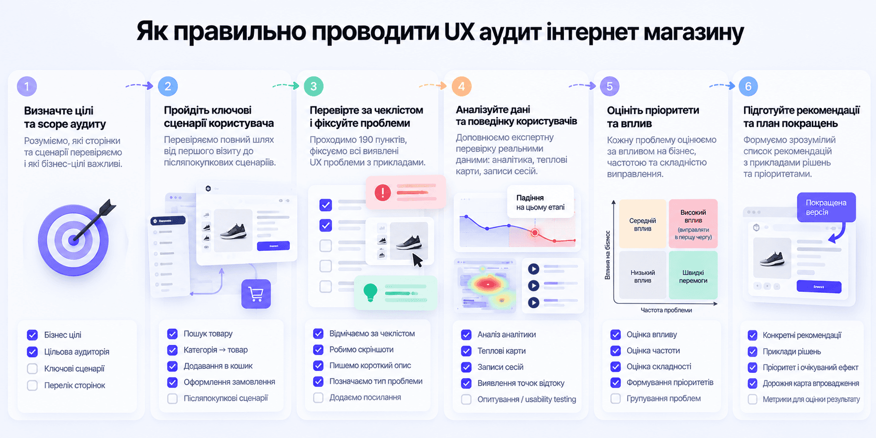
Do not simply load the homepage and mechanically check off 190 boxes.
Start with the key user journeys.
For example: find a specific item via the catalog. Find it via search. Filter a category. Compare several options. Review a product detail page. Add an item to the cart. Change its quantity. Complete the checkout process. Repeat the same workflow from a smartphone.
Next, walk through edge-case scenarios: mistyped search terms, zero search results, an unavailable size, an empty cart, form validation errors, failed payments, and navigating back from a PDP to a deeply scrolled catalog.
It is precisely in these situations that friction points emerge—issues that rarely show up in polished mockups of primary pages.
Do not treat all UX problems equally
After completing an audit, it is easy to end up with a list of dozens of issues. However, fixing them in random order is a mistake.
At CHIZZ, we evaluate every issue across at least three key parameters:
Impact. To what extent does the issue prevent the user from completing their goal?
Frequency. How often do users encounter this specific scenario?
Business value. How closely tied is this scenario to a purchase or another primary business conversion?
For instance, a minor visual inconsistency in the footer may appear across every page yet have virtually zero impact on sales. Conversely, a confusing error message during payment entry might occur less frequently, but it directly prevents orders from going through.
Prioritization in these scenarios must naturally differ.
A checklist does not replace user research
Even a 190-point checklist cannot anticipate every unique challenge an individual store faces. An expert can spot deviations from established UX heuristics, but may not always catch issues specific to the store's audience, catalog, or business model.
That is why the logical next step following an expert review is analyzing product metrics, heatmaps, session recordings, and conducting usability testing.
Analytics will reveal where users drop off. Session recordings will show what they did right beforehand. Usability testing will uncover why a particular element or scenario creates friction.
A UX audit should conclude with an action plan, not just a list of bugs

Simply finding 50 issues and assembling them into a PDF is not enough. The output of a successful audit must be a clear, prioritized roadmap of hypotheses and recommendations. The team needs to understand what should be fixed first, why it matters, and how the user experience will improve as a result.
Some issues can be solved with minor UI tweaks or revised copy. Others may require rethinking the information architecture, catalog navigation, search behavior, or checkout flow. In certain cases, an audit will reveal that an entire user journey needs to be redesigned from scratch.
Ultimately, a UX audit should be seen not as an appraisal of visual design, but as a practical method for finding the exact spots where the interface prevents customers from completing a purchase.


" width="68.80023495816431px"><path d="M 4.853 0.229 C 2.752 -0.794 0.742 1.857 0 3.31 C 0.62 7.42 0.421 10.396 0.244 11.37 C 1.34 12.771 4.906 13.54 5.957 11.548 C 7.007 9.558 7.477 1.511 4.852 0.23 Z" fill="rgb(255, 255, 255)" height="12.755288116790886px" id="ZCZVTiIXa" stroke-dasharray="" stroke-linecap="butt" stroke-linejoin="miter" stroke-miterlimit="10" stroke-width="1.23" stroke="rgb(0, 0, 0)" transform="translate(62.007 43.767)" width="6.793097659580333px"/><path d="M 0 0 C 1.437 0.617 2.272 3.716 0.258 5.234" fill="transparent" height="5.233798974902236px" id="AacllobhZ" stroke-dasharray="" stroke-linecap="butt" stroke-linejoin="miter" stroke-miterlimit="10" stroke-width="1.23" stroke="rgb(0, 0, 0)" transform="translate(64.709 47.658)" width="1.4545419866479055px"/><path d="M 1.94 0.229 C 4.041 -0.794 6.051 1.857 6.794 3.31 C 6.173 7.42 6.372 10.396 6.549 11.37 C 5.454 12.771 1.887 13.54 0.837 11.548 C -0.214 9.558 -0.684 1.511 1.94 0.23 Z" fill="rgb(255, 255, 255)" height="12.755288116790886px" id="pEDJQVy2w" stroke-dasharray="" stroke-linecap="butt" stroke-linejoin="miter" stroke-miterlimit="10" stroke-width="1.23" stroke="rgb(0, 0, 0)" transform="translate(0 43.767)" width="6.7942440549467005px"/><path d="M 1.455 0 C 0.018 0.617 -0.818 3.716 1.197 5.234" fill="transparent" height="5.233798974902236px" id="xOvJKZNxm" stroke-dasharray="" stroke-linecap="butt" stroke-linejoin="miter" stroke-miterlimit="10" stroke-width="1.23" stroke="rgb(0, 0, 0)" transform="translate(2.638 47.658)" width="1.4550601551503437px"/><path d="M 38.403 68.113 C 26.454 72.892 13.11 63.334 7.932 57.955 C 2.196 50.786 0.363 36.246 0.164 29.874 C -0.314 26.05 0.363 17.527 0.763 13.743 L 3.749 5.376 L 14.504 1.195 L 37.806 0 C 39.997 0.398 45.454 1.553 49.755 2.987 C 55.133 4.78 57.522 13.742 58.121 16.133 C 58.599 18.044 58.32 34.853 58.121 43.019 C 57.522 47.798 53.341 62.138 38.403 68.113 Z" fill="rgb(255, 255, 255)" height="69.41149940138297px" id="yZYyIx6io" stroke-dasharray="" stroke-linecap="butt" stroke-linejoin="round" stroke-width="1.23" stroke="rgb(0, 0, 0)" transform="translate(4.872 16.589)" width="58.38457217823136px"/><path d="M 16.131 9.081 C 13.941 3.704 7.648 -4.303 0 6.69 C 2.191 10.675 8.485 16.728 16.131 9.081 Z M 28.678 7.886 C 30.868 2.508 37.162 -5.497 44.809 5.496 C 42.619 9.479 36.326 15.534 28.678 7.886 Z" fill="transparent" height="12.75153470949805px" id="Q5nplVQds" stroke-dasharray="" stroke-linecap="butt" stroke-linejoin="miter" stroke-miterlimit="10" stroke-width="1.23" stroke="rgb(0, 0, 0)" transform="translate(11.605 43.954)" width="44.80918164991997px"/><path d="M 0 4.182 C 0 1.872 1.872 0 4.182 0 C 6.492 0 8.364 1.872 8.364 4.182 C 8.364 6.492 6.492 8.364 4.182 8.364 C 1.872 8.364 0 6.492 0 4.182 Z" fill="rgb(0, 0, 0)" height="8.364249629374285px" id="CsixW4Nye" transform="translate(43.274 45.863)" width="8.364249629374271px"/><path d="M 0 4.182 C 0 1.872 1.872 0 4.182 0 C 6.492 0 8.364 1.872 8.364 4.182 C 8.364 6.492 6.492 8.364 4.182 8.364 C 1.872 8.364 0 6.492 0 4.182 Z" fill="rgb(0, 0, 0)" height="8.364249629374264px" id="mtQGxWjK3" transform="translate(14.591 47.061)" width="8.364249629374267px"/><path d="M 0 1.195 C 0 0.535 0.535 0 1.195 0 C 1.856 0 2.391 0.535 2.391 1.195 C 2.391 1.856 1.856 2.391 1.195 2.391 C 0.535 2.391 0 1.856 0 1.195 Z" fill="rgb(255, 255, 255)" height="2.3908386866572187px" id="w8AgI4KSu" transform="translate(48.05 48.255)" width="2.390838686657247px"/><path d="M 0 1.195 C 0 0.535 0.535 0 1.195 0 C 1.856 0 2.391 0.535 2.391 1.195 C 2.391 1.856 1.856 2.391 1.195 2.391 C 0.535 2.391 0 1.856 0 1.195 Z" fill="rgb(255, 255, 255)" height="2.3908386866572187px" id="RFyjFdh2K" transform="translate(19.375 49.451)" width="2.3908386866572506px"/><path d="M 4.036 1.556 C 1.73 1.146 0.385 3.427 0 5.128 C 2.306 3.086 4.036 3.257 4.613 3.596 C 6.459 5.23 11.149 5.299 13.263 5.128 C 17.876 4.618 15.569 1.554 13.84 2.065 C 12.616 2.425 6.919 2.065 4.036 1.554 Z M 40.698 0.085 C 43.061 -0.431 44.581 1.513 45.076 3.004 C 42.574 1.336 40.795 1.601 40.218 1.943 C 38.402 3.519 33.557 3.889 31.36 3.875 C 26.562 3.724 28.774 0.842 30.591 1.184 C 31.876 1.424 37.746 0.73 40.698 0.085 Z" fill="rgb(0, 0, 0)" height="5.192087782726427px" id="gD39dSMek" stroke-dasharray="" stroke-linecap="butt" stroke-linejoin="miter" stroke-miterlimit="10" stroke-width="1.23" stroke="rgb(0, 0, 0)" transform="translate(11.346 36.58)" width="45.07578690879518px"/><path d="M 56.257 17.784 C 61.635 20.772 61.235 35.509 60.439 42.878 C 58.528 41.444 57.65 36.305 57.451 33.917 C 57.451 20.054 45.9 18.183 40.125 18.979 C 33.91 22.325 22.798 21.17 18.017 20.175 C 4.634 18.741 2.086 35.51 2.484 44.073 C 1.05 39.772 1.488 30.332 1.886 26.148 C 0.93 25.671 -0.106 21.967 0.093 20.175 C -0.385 17.306 1.089 16.192 1.886 15.993 C 0.452 13.124 1.289 11.212 2.484 10.615 C 1.05 8.224 4.675 5.238 6.666 4.042 C 6.187 2.13 9.255 1.253 10.848 1.055 C 10.848 0.1 15.23 0.259 16.823 1.055 C 17.779 -0.856 21.602 0.259 23.396 1.055 C 25.187 -1.334 31.163 2.25 31.76 1.653 C 32.357 1.054 43.71 4.042 50.283 8.225 C 55.541 11.57 56.456 15.991 56.257 17.784 Z" fill="rgb(0, 0, 0)" height="44.07331699872831px" id="IBXo1afcW" stroke-dasharray="" stroke-linecap="butt" stroke-linejoin="round" stroke-width="1.23" stroke="rgb(0, 0, 0)" transform="translate(3.149 0)" width="60.90540811136909px"/><path d="M 4.914 8.6 C 4.928 7.32 3.966 4.3 0 2.457 M 14.743 6.143 C 14.758 4.863 13.795 1.843 9.829 0 M 25.8 6.143 C 25.815 4.863 24.852 1.843 20.886 0 M 38.086 9.829 C 38.1 8.549 37.138 5.529 33.172 3.686" fill="transparent" height="9.828730631218367px" id="yF9hvy0D6" stroke-dasharray="" stroke-linecap="butt" stroke-linejoin="miter" stroke-miterlimit="10" stroke-width="1.23" stroke="rgb(255, 255, 255)" transform="translate(10.118 1.229)" width="38.08647011135237px"/><path d="M 15.972 6.143 C 12.985 1.508 5.609 -4.983 0 6.143" fill="transparent" height="6.143186797809202px" id="S7kDdhPuD" stroke-dasharray="" stroke-linecap="butt" stroke-linejoin="round" stroke-width="1.23" stroke="rgb(0, 0, 0)" transform="translate(27.028 65.115)" width="15.971687012612456px"/><path d="M 3.106 0.493 C 4.998 3.584 7.703 9.993 3.395 10.901 C -1.99 12.035 0.346 1.417 1.566 0" fill="transparent" height="10.985871866875232px" id="m1g0PK9jZ" stroke-dasharray="" stroke-linecap="butt" stroke-linejoin="round" stroke-width="1.23" stroke="rgb(0, 0, 0)" transform="translate(31.777 54.002)" width="5.699674962042929px"/></g></svg>)