
Banking App UX: How to Create a Simple and Clear Financial Product
10/1/26

Author
Kirill Chistiakov

Mobile banking has long ceased to be just an additional way to check a balance or transfer money. For many users, a banking app has become the primary interface for managing their finances.
Through it, people receive salaries, pay for purchases, transfer money, open deposits, manage cards, exchange currency, analyze expenses, and resolve payment issues. This means that even a minor UX issue can arise in scenarios directly involving the user's money.
That is precisely why the design of a banking application must solve a more complex task than simply making the interface look modern. It must be simple, intuitive, fast, and predictable all at once, while also accounting for security and the complexity of financial transactions.
Let's look at the key UX principles that help create banking and fintech products that are convenient for everyday use.
Good banking UX starts with trust

In most digital products, an error might mean lost time or the need to repeat an action. In a banking app, a user may perceive even slight ambiguity much more seriously, because their money is at stake.
A person must clearly understand what is happening with their account, whether a transfer went through, what amount will be debited, whom they are sending money to, and whether the transaction can be canceled. If the interface leaves the user in uncertainty, trust in the product quickly erodes.
Therefore, financial UX must constantly answer simple questions: what is happening right now, what will happen after tapping the button, was the transaction completed successfully, and what to do if a problem arises.
A clear transaction status, payment confirmation, fee information, and sensible error messages can be more important for user experience than complex visual effects.
Core financial scenarios should be as simple as possible

A banking app can contain dozens of features, but most users regularly return to a small set of core scenarios: checking their balance, finding a transaction, transferring money, paying a bill, topping up a card, or viewing account details.
It is these scenarios that should require the fewest unnecessary actions. If making a routine transfer requires the user to navigate through multiple menus, search for a recipient, and enter the same data every time, the issue quickly becomes noticeable.
This is especially crucial for actions that people perform regularly. One extra step may seem insignificant during the first use, but if the user repeats this action dozens of times a month, unnecessary complexity accumulates.
Therefore, working on banking UX should begin not with the number of features, but with core user scenarios and the frequency of their use.
The home screen must answer the main questions

After opening a banking app, the user usually wants to quickly get information about their finances. They don't need to see all the bank's capabilities right away.
The home screen should provide a clear overview of the current state of accounts. Balances, cards, recent transactions, and key actions should be accessible without having to search for them in menus.
At the same time, one common problem in financial products is the gradual cluttering of the home screen. As the product evolves, loans, deposits, cashback, insurance, investments, partner offers, and ad banners begin to appear on it.
As a result, core banking operations start competing for attention with supplementary services.
A good information hierarchy must account for the frequency and importance of actions. What a person uses every day shouldn't be lost among features they only need a few times a year.
Complex financial terms need to be explained

A bank operates with complex financial and legal terminology, but a banking app user is not obligated to know it.
APR, IBAN, credit limit, available balance, payment authorization, hold, exchange rate, and other concepts may be obvious to people working in finance, but unclear to some customers.
The interface should translate the complexity of banking processes into plain language. If a professional term must be retained, its meaning can be explained nearby or additional information can be provided on demand.
It is especially important to avoid ambiguity where the user is making a financial decision. A person must understand the product terms, fee amounts, interest rates, and the potential consequences of an action before confirming it.
Transferring money requires special attention to detail

Transferring money is one of the most critical scenarios in a banking app. Here, one must simultaneously ensure speed, clarity, and error prevention.
Before final confirmation, the user should be able to easily verify the recipient, amount, currency, debit account, and any potential fee. This information should be visually organized so that any error can be spotted within seconds.
After the transaction is completed, the system must clearly communicate the outcome. It is not enough to simply close the screen or display a brief notification. It is important for the user to know that the payment has been accepted, is being processed, or is already completed.
If the operation failed, the message should explain the reason and the next step. A generic "Something went wrong" text does virtually nothing to help someone who doesn't know whether their money was debited.
Security shouldn't make the product inconvenient

Financial products require significantly more checks and restrictions than most standard mobile apps. Authorization, transaction confirmations, biometrics, limits, new device verification, and other mechanisms are an essential part of the product.
The UX challenge is not to remove these checks, but to make them understandable.
If the app asks a user to re-verify their identity, it is worth explaining the reason. If a transaction is blocked for security reasons, it is necessary to explain what happened and how to restore access.
Users are much more accepting of an extra step when they understand its purpose. An unexplained restriction is perceived as a product flaw, whereas a clear explanation can be seen as protection.
Transparency is more important than a flashy interface
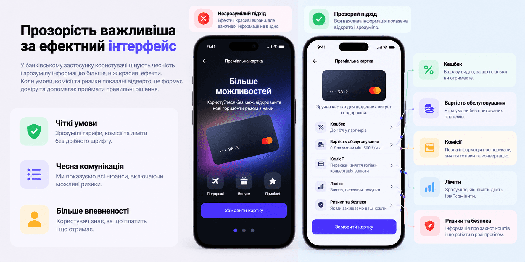
In a banking product, there should be no surprises after tapping the confirmation button. Fees, exchange rates, processing times, and other important terms must be shown before the action is finalized.
This especially applies to transactions where the final amount may differ from the initial one, such as international transfers or currency exchanges.
Instead of simply displaying an exchange rate, the interface can explain how much money will be debited and how much the other party will receive. This is much easier to understand than forcing the user to calculate the final result themselves.
Transparency is also crucial after a transaction has been made. The transaction history should make it easy to understand where the money went, when it occurred, and the status of the transaction.
Transaction history should help find information

As the number of transactions increases, a simple transaction list is no longer sufficient. A user might remember paying for something a few weeks ago, but might not recall the exact date or the company name shown on the bank statement.
Therefore, the history should support proper search and filtering by period, amount, category, or transaction type. Clear merchant names, logos, and automatic expense categorization can serve as valuable additions.
When opening a transaction, the user should see detailed information without needing to contact support. The date, amount, status, recipient, fee, category, and other vital details should be gathered in one place.
This transforms the transaction history from a basic bank statement into a useful personal finance management tool.
Financial analytics should be understandable without a degree in finance

Expense charts can look impressive, but their value lies beyond mere visualization. Analytics should help users understand their own financial behavior.
Instead of dozens of complex charts, it is better to provide a few clear answers: How much did the person spend this month? What took the largest share of the money? How have expenses changed compared to the previous period? How much was saved?
Contextual insights can be especially helpful. For example, the app could show that spending in a specific category has risen significantly or that a recurring payment has become more expensive.
At the same time, analytics should not overwhelm the user with numbers. If a chart requires a separate guide on how to read it, the information can probably be presented more simply.
Personalization should simplify banking

Banking apps work with a large amount of user behavior data. This creates opportunities to tailor the interface and recommendations to specific scenarios.
A person who regularly transfers money to the same recipient can be given quick access to that contact. A user who frequently exchanges currency can see the relevant currency accounts closer to the home screen.
However, personalization must deliver clear value. If it turns merely into a way to display more credit or partner offers, it can have the opposite effect.
Good personalization shortens the path to the desired action and helps the user achieve results faster.
Onboarding shouldn't turn into an app manual

Banking products often have a more complex registration process due to identity verification, documents, and other requirements. Because of this, it is particularly crucial not to add unnecessary steps where they aren't needed.
The user should understand roughly how many steps remain, why specific information is needed, and what will happen after verification is complete.
After registration, there is no need to display a lengthy walkthrough of all the product's features. It is far more effective to introduce users to features within the context of their actions.
If someone opens the savings section for the first time, that is the right moment to explain its features. If they have never made international transfers, there is no need to tell them about them during the first launch.
Notifications and alerts are part of the UX
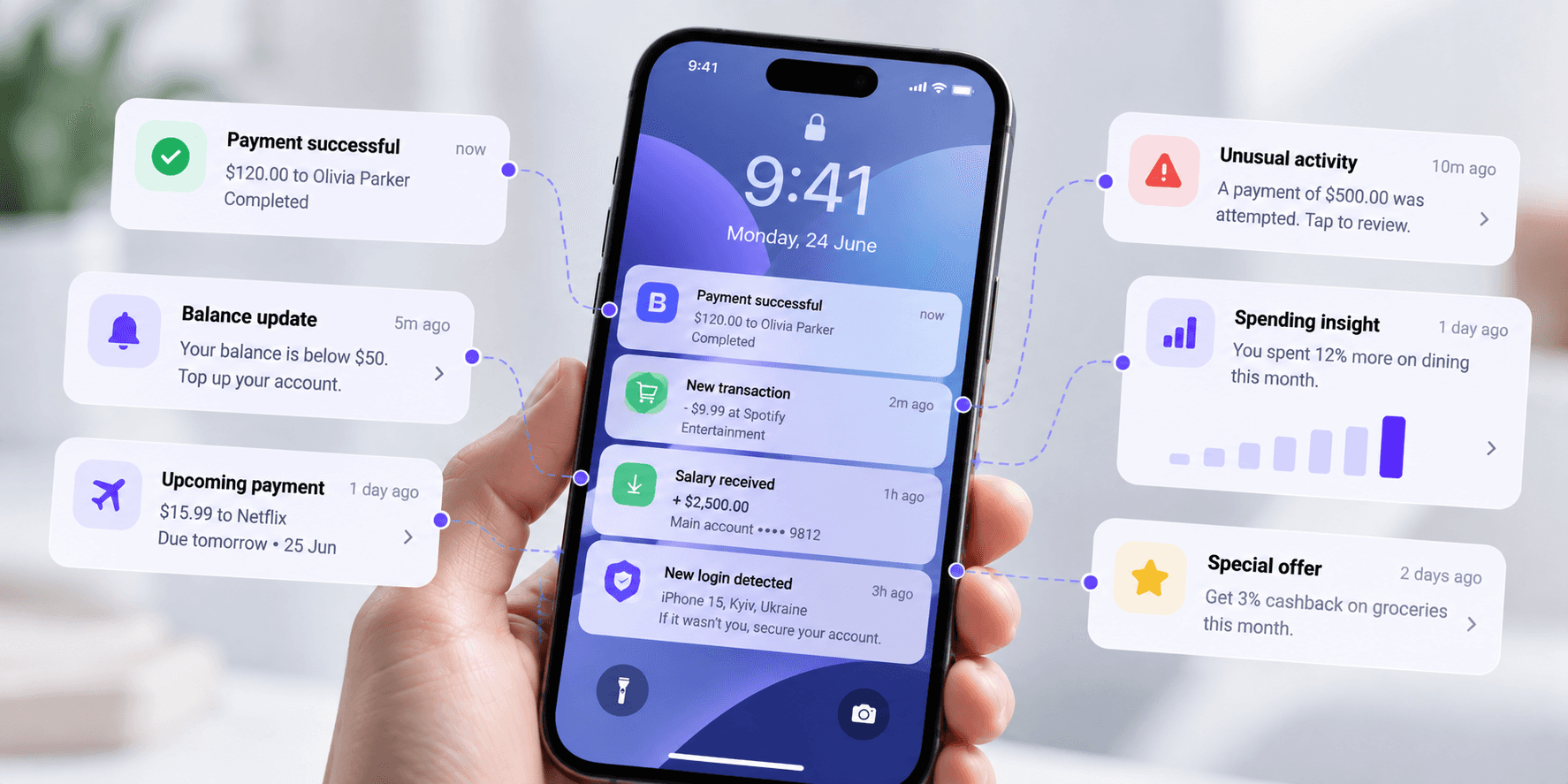
Push notifications in a banking app provide practical value. They can confirm payments, notify about incoming funds, remind about recurring payments, or alert to suspicious activity.
However, if a bank uses the same channel for a high volume of promotional messages, important alerts start getting lost among the marketing noise.
Users should be given control over the types of notifications they receive. At the same time, critical security or transaction notifications must remain distinctly separated from promotions.
Even the copy of the message matters. Instead of an abstract "transaction completed", it is better to display the amount, transaction type, and enough context for the user to immediately understand what happened.
Accessibility should be built into the design from the start

Banking services are needed by people with diverse abilities, ages, and levels of digital literacy. Therefore, accessibility shouldn't be an afterthought feature that the team remembers right before launch.
Sufficient contrast, readable text, clear element labels, support for system font scaling, adequate tap target sizes, and proper screen reader compatibility must all be taken into account when creating the interface.
It is also important not to rely solely on color to convey information. For example, positive and negative transactions are better distinguished not only by green and red colors, but also with symbols, text, or other visual cues.
For a financial product, accessibility is especially critical because a person must be able to manage their own money independently.
Error design is part of the banking experience

The happy path is not the only path. A card may be blocked, an account might lack sufficient funds, a bank may decline a transaction, or a user might lose access to their old phone number or accidentally enter incorrect details.
Therefore, banking product design must not be tailored solely around successful transactions.
A good error message explains what happened, whether there is any risk to the user's money, and what they can do next. If the issue can be resolved directly in the app, the next action should be readily available.
The worst scenario occurs when a user sees an error but does not know whether money was debited or where to turn for help.
Support should be available right when a problem occurs

When it comes to money, a user does not want to hunt for a support page through multiple levels of menus, especially when they see an unfamiliar transaction or cannot complete an important payment.
Contextual support makes it possible to address an issue directly from the relevant screen. For example, in the transaction details, you can place an option to report a problem or ask a question regarding that specific transaction.
This also allows providing the support team with more context. The user does not need to manually explain the transaction number, date, and amount if the system already knows which screen they submitted the request from.
Micro-animations should clarify, not distract

Animation can be a useful part of banking UX if it helps users understand the system state. It can indicate that an operation is being processed, confirm a successful action, or explain transitions between interface states.
However, a financial app shouldn't turn every interaction into a show. Excessive animation slows down workflows and can create an unwanted impression of frivolity in critical scenarios.
Effects should be used with particular care during payments, card blocking, limit adjustments, and other crucial actions. In such situations, a clear outcome is more important than emotional appeal.
Gamification is not suitable for every financial scenario

Progress bars, goals, achievements, and other gamification elements can help users develop healthy financial habits—for example, saving a specific amount, regularly adding to savings, or keeping a budget under control.
However, financial decisions shouldn't be turned into a game merely to boost app engagement.
One must be particularly careful with loans, investments, and other scenarios where the user makes decisions involving financial risk.
Gamification should help people achieve their financial goals, rather than simply compelling them to open the app more frequently.
Visual design also builds trust

Functionality and usability are the foundation of a banking product, but that does not mean visual design does not matter.
Consistent typography, clear hierarchy, thoughtful color usage, high-quality icons, and unified components create a sense of product integrity.
It is especially problematic when different parts of a banking app look like completely different products. This often happens in systems that have evolved over many years, gradually receiving new features from different teams.
A Design System helps maintain consistency, but a component library alone does not automatically solve the problem. Unified rules are also needed for component behavior, screen layouts, notifications, forms, and core user flows.
How to know when a banking app needs a UX redesign

A redesign is not only necessary when an interface looks outdated. Issues in user behavior can be much more telling signals.
People may regularly contact support with the same questions, fail to find certain features, drop off during the registration flow, make mistakes during transfers, or barely use parts of the product's capabilities.
Another signal arises when a product has grown significantly, but its information architecture has remained unchanged. New features are gradually crammed into existing sections, menus become convoluted, and the home screen gets overcrowded.
In such cases, a cosmetic UI refresh is not enough. It becomes necessary to research user scenarios, rethink the product structure, and determine which actions truly deserve top priority.
UX research for banking products

It is particularly risky to design financial products based solely on the team's internal assumptions. What seems obvious to a designer or a banking specialist may be perplexing to an ordinary user.
UX research helps uncover how people actually interpret financial terms, where they hesitate, which elements spark distrust, and which flows turn out to be more complicated than the team anticipated.
To validate different parts of the product, one can use interviews, usability testing, behavioral analytics, prototyping, and information architecture testing.
It is especially vital to test mission-critical scenarios: registration, transfers, card management, account recovery, transaction confirmations, and issue resolution.
Good banking UX makes complex processes simple to understand

A banking product can have a complex internal architecture, dozens of integrations, security rules, and regulatory constraints. The user doesn't need to see all that complexity.
They just need to quickly check their balance, complete a desired action, receive clear confirmation, and feel confident that their money is safe.
That is precisely one of the primary missions of banking app UX: not to eliminate the complexity of the financial system, but to organize it properly at the interface level.
When navigation is clear, financial data is effortless to read, critical actions are predictable, and the system transparently communicates its state, users don't have to think about how the app itself works. They can simply focus on the reason they opened it in the first place: managing their finances.


" width="68.80023495816431px"><path d="M 4.853 0.229 C 2.752 -0.794 0.742 1.857 0 3.31 C 0.62 7.42 0.421 10.396 0.244 11.37 C 1.34 12.771 4.906 13.54 5.957 11.548 C 7.007 9.558 7.477 1.511 4.852 0.23 Z" fill="rgb(255, 255, 255)" height="12.755288116790886px" id="ZCZVTiIXa" stroke-dasharray="" stroke-linecap="butt" stroke-linejoin="miter" stroke-miterlimit="10" stroke-width="1.23" stroke="rgb(0, 0, 0)" transform="translate(62.007 43.767)" width="6.793097659580333px"/><path d="M 0 0 C 1.437 0.617 2.272 3.716 0.258 5.234" fill="transparent" height="5.233798974902236px" id="AacllobhZ" stroke-dasharray="" stroke-linecap="butt" stroke-linejoin="miter" stroke-miterlimit="10" stroke-width="1.23" stroke="rgb(0, 0, 0)" transform="translate(64.709 47.658)" width="1.4545419866479055px"/><path d="M 1.94 0.229 C 4.041 -0.794 6.051 1.857 6.794 3.31 C 6.173 7.42 6.372 10.396 6.549 11.37 C 5.454 12.771 1.887 13.54 0.837 11.548 C -0.214 9.558 -0.684 1.511 1.94 0.23 Z" fill="rgb(255, 255, 255)" height="12.755288116790886px" id="pEDJQVy2w" stroke-dasharray="" stroke-linecap="butt" stroke-linejoin="miter" stroke-miterlimit="10" stroke-width="1.23" stroke="rgb(0, 0, 0)" transform="translate(0 43.767)" width="6.7942440549467005px"/><path d="M 1.455 0 C 0.018 0.617 -0.818 3.716 1.197 5.234" fill="transparent" height="5.233798974902236px" id="xOvJKZNxm" stroke-dasharray="" stroke-linecap="butt" stroke-linejoin="miter" stroke-miterlimit="10" stroke-width="1.23" stroke="rgb(0, 0, 0)" transform="translate(2.638 47.658)" width="1.4550601551503437px"/><path d="M 38.403 68.113 C 26.454 72.892 13.11 63.334 7.932 57.955 C 2.196 50.786 0.363 36.246 0.164 29.874 C -0.314 26.05 0.363 17.527 0.763 13.743 L 3.749 5.376 L 14.504 1.195 L 37.806 0 C 39.997 0.398 45.454 1.553 49.755 2.987 C 55.133 4.78 57.522 13.742 58.121 16.133 C 58.599 18.044 58.32 34.853 58.121 43.019 C 57.522 47.798 53.341 62.138 38.403 68.113 Z" fill="rgb(255, 255, 255)" height="69.41149940138297px" id="yZYyIx6io" stroke-dasharray="" stroke-linecap="butt" stroke-linejoin="round" stroke-width="1.23" stroke="rgb(0, 0, 0)" transform="translate(4.872 16.589)" width="58.38457217823136px"/><path d="M 16.131 9.081 C 13.941 3.704 7.648 -4.303 0 6.69 C 2.191 10.675 8.485 16.728 16.131 9.081 Z M 28.678 7.886 C 30.868 2.508 37.162 -5.497 44.809 5.496 C 42.619 9.479 36.326 15.534 28.678 7.886 Z" fill="transparent" height="12.75153470949805px" id="Q5nplVQds" stroke-dasharray="" stroke-linecap="butt" stroke-linejoin="miter" stroke-miterlimit="10" stroke-width="1.23" stroke="rgb(0, 0, 0)" transform="translate(11.605 43.954)" width="44.80918164991997px"/><path d="M 0 4.182 C 0 1.872 1.872 0 4.182 0 C 6.492 0 8.364 1.872 8.364 4.182 C 8.364 6.492 6.492 8.364 4.182 8.364 C 1.872 8.364 0 6.492 0 4.182 Z" fill="rgb(0, 0, 0)" height="8.364249629374285px" id="CsixW4Nye" transform="translate(43.274 45.863)" width="8.364249629374271px"/><path d="M 0 4.182 C 0 1.872 1.872 0 4.182 0 C 6.492 0 8.364 1.872 8.364 4.182 C 8.364 6.492 6.492 8.364 4.182 8.364 C 1.872 8.364 0 6.492 0 4.182 Z" fill="rgb(0, 0, 0)" height="8.364249629374264px" id="mtQGxWjK3" transform="translate(14.591 47.061)" width="8.364249629374267px"/><path d="M 0 1.195 C 0 0.535 0.535 0 1.195 0 C 1.856 0 2.391 0.535 2.391 1.195 C 2.391 1.856 1.856 2.391 1.195 2.391 C 0.535 2.391 0 1.856 0 1.195 Z" fill="rgb(255, 255, 255)" height="2.3908386866572187px" id="w8AgI4KSu" transform="translate(48.05 48.255)" width="2.390838686657247px"/><path d="M 0 1.195 C 0 0.535 0.535 0 1.195 0 C 1.856 0 2.391 0.535 2.391 1.195 C 2.391 1.856 1.856 2.391 1.195 2.391 C 0.535 2.391 0 1.856 0 1.195 Z" fill="rgb(255, 255, 255)" height="2.3908386866572187px" id="RFyjFdh2K" transform="translate(19.375 49.451)" width="2.3908386866572506px"/><path d="M 4.036 1.556 C 1.73 1.146 0.385 3.427 0 5.128 C 2.306 3.086 4.036 3.257 4.613 3.596 C 6.459 5.23 11.149 5.299 13.263 5.128 C 17.876 4.618 15.569 1.554 13.84 2.065 C 12.616 2.425 6.919 2.065 4.036 1.554 Z M 40.698 0.085 C 43.061 -0.431 44.581 1.513 45.076 3.004 C 42.574 1.336 40.795 1.601 40.218 1.943 C 38.402 3.519 33.557 3.889 31.36 3.875 C 26.562 3.724 28.774 0.842 30.591 1.184 C 31.876 1.424 37.746 0.73 40.698 0.085 Z" fill="rgb(0, 0, 0)" height="5.192087782726427px" id="gD39dSMek" stroke-dasharray="" stroke-linecap="butt" stroke-linejoin="miter" stroke-miterlimit="10" stroke-width="1.23" stroke="rgb(0, 0, 0)" transform="translate(11.346 36.58)" width="45.07578690879518px"/><path d="M 56.257 17.784 C 61.635 20.772 61.235 35.509 60.439 42.878 C 58.528 41.444 57.65 36.305 57.451 33.917 C 57.451 20.054 45.9 18.183 40.125 18.979 C 33.91 22.325 22.798 21.17 18.017 20.175 C 4.634 18.741 2.086 35.51 2.484 44.073 C 1.05 39.772 1.488 30.332 1.886 26.148 C 0.93 25.671 -0.106 21.967 0.093 20.175 C -0.385 17.306 1.089 16.192 1.886 15.993 C 0.452 13.124 1.289 11.212 2.484 10.615 C 1.05 8.224 4.675 5.238 6.666 4.042 C 6.187 2.13 9.255 1.253 10.848 1.055 C 10.848 0.1 15.23 0.259 16.823 1.055 C 17.779 -0.856 21.602 0.259 23.396 1.055 C 25.187 -1.334 31.163 2.25 31.76 1.653 C 32.357 1.054 43.71 4.042 50.283 8.225 C 55.541 11.57 56.456 15.991 56.257 17.784 Z" fill="rgb(0, 0, 0)" height="44.07331699872831px" id="IBXo1afcW" stroke-dasharray="" stroke-linecap="butt" stroke-linejoin="round" stroke-width="1.23" stroke="rgb(0, 0, 0)" transform="translate(3.149 0)" width="60.90540811136909px"/><path d="M 4.914 8.6 C 4.928 7.32 3.966 4.3 0 2.457 M 14.743 6.143 C 14.758 4.863 13.795 1.843 9.829 0 M 25.8 6.143 C 25.815 4.863 24.852 1.843 20.886 0 M 38.086 9.829 C 38.1 8.549 37.138 5.529 33.172 3.686" fill="transparent" height="9.828730631218367px" id="yF9hvy0D6" stroke-dasharray="" stroke-linecap="butt" stroke-linejoin="miter" stroke-miterlimit="10" stroke-width="1.23" stroke="rgb(255, 255, 255)" transform="translate(10.118 1.229)" width="38.08647011135237px"/><path d="M 15.972 6.143 C 12.985 1.508 5.609 -4.983 0 6.143" fill="transparent" height="6.143186797809202px" id="S7kDdhPuD" stroke-dasharray="" stroke-linecap="butt" stroke-linejoin="round" stroke-width="1.23" stroke="rgb(0, 0, 0)" transform="translate(27.028 65.115)" width="15.971687012612456px"/><path d="M 3.106 0.493 C 4.998 3.584 7.703 9.993 3.395 10.901 C -1.99 12.035 0.346 1.417 1.566 0" fill="transparent" height="10.985871866875232px" id="m1g0PK9jZ" stroke-dasharray="" stroke-linecap="butt" stroke-linejoin="round" stroke-width="1.23" stroke="rgb(0, 0, 0)" transform="translate(31.777 54.002)" width="5.699674962042929px"/></g></svg>)