
Accessibility in UX/UI design: how to create accessible digital products
10/3/26

Author
Kirill Chistiakov

A digital product may look modern, have well-thought-out navigation, and run quickly, yet remain inconvenient or entirely inaccessible to a portion of users. Low contrast, small buttons, unclear form errors, mouse-only navigation, or the lack of proper page structure can create barriers that a designer or developer might not even notice.
Accessibility, or inclusive design, helps in designing websites, mobile apps, and complex systems so that they can be used by people with diverse perceptual and interaction abilities. At the same time, many solutions that improve accessibility simultaneously make the product simpler for all users.
What accessibility is in digital products

The term accessibility, digital accessibility, or inclusive design means that a user can perceive information, understand it, navigate the interface, and perform necessary actions regardless of their physical or cognitive abilities. Throughout this post, we will use the word accessibility; we hope we have conveyed what it is, and if not, we recommend rereading this paragraph once more.
This applies to far more scenarios than it might seem. Someone cannot see the screen and uses a screen reader. Another user has low vision and zooms in on the interface. Someone finds it difficult to control a mouse precisely. Another person cannot hear audio in a video. A user with cognitive differences may struggle with large volumes of information or unpredictable navigation.
Accessibility and inclusive design should be part of the product itself, not a separate settings panel. Such a product must accommodate various ways of interacting with the interface, rather than assuming that all users see, hear, and operate the device identically.
Accessibility and inclusive design are not the same thing

Accessibility and inclusive design are related, but they have different focuses. Accessibility primarily addresses the barriers that can prevent people with disabilities from using a digital product. Inclusive design takes a broader view and considers user diversity, including their age, language, culture, technical experience, devices, and varying life situations.
For example, captions are essential for a user who cannot hear audio. However, they are also useful for someone watching a video on the subway without headphones. Good contrast helps users with low vision, but it also improves smartphone screen readability in the sun. Large tap targets are important for people with motor impairments, but they are also convenient when someone uses a phone with one hand.
Therefore, accessibility often enhances the product far beyond its initial audience.
WCAG as the foundation of digital accessibility

One of the primary benchmarks for creating accessible digital products is the Web Content Accessibility Guidelines. WCAG outlines requirements and recommendations that help make web content more accessible.
WCAG is built around four core principles: Information must be perceivable. The interface must be operable. Content and system behavior must be understandable. The product must be robust and compatible with various technologies and interaction methods.
These principles help frame accessibility not as a set of disconnected rules about colors and buttons, but as a characteristic of the entire user experience.
Accessibility begins with visual hierarchy

A user should quickly understand what is in front of them and which interface elements are the most important. Headings, text, buttons, fields, notifications, and other components must have a clear visual hierarchy.
If all elements look equally important, scanning the interface becomes harder. If secondary text is too light, parts of it may become virtually invisible. If an active state differs only by a very subtle color change, the user might not notice it.
A solid hierarchy helps users navigate the interface faster, regardless of whether they have visual impairments.
Contrast is not just a matter of style

Modern interfaces often use light gray text, minimalist borders, and very subtle shades. Visually this might look clean, but excessively low contrast degrades readability, especially for people with visual impairments.
Form placeholders, secondary labels, disabled elements, text over photos, and data within charts can be particularly problematic.
Contrast must be checked not only for the main body text. It is important to look at all elements through which the user receives information or understands the state of the system.
Do not convey information through color alone

Color is great for quickly identifying statuses, but it should not be the sole method of conveying information.
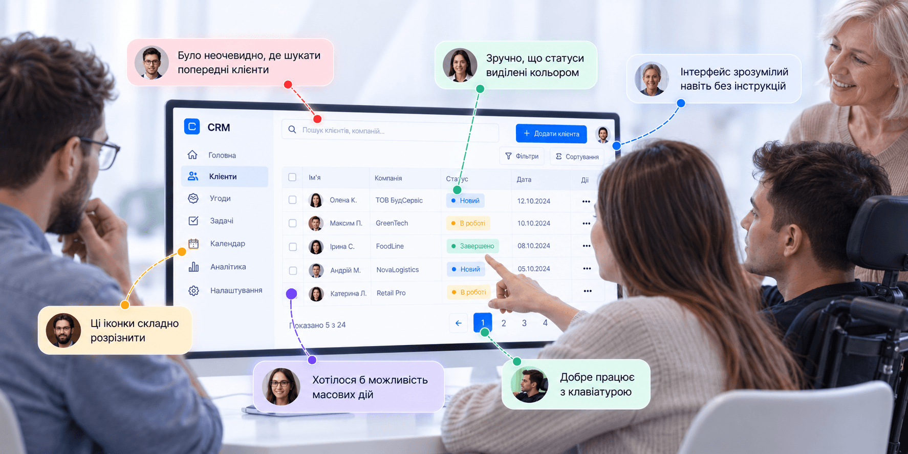
For example, in a CRM, green can indicate a successfully completed task, red an overdue one, and yellow one that requires attention. But if the difference exists only in color, some users may not be able to see it.
Color can be supplemented with an icon, text status, element shape, or another visual cue. This ensures the information remains understandable even without perceiving the specific color.
Text size must remain comfortable

The desire to fit more information onto a single screen often leads to text that is too small. This is especially noticeable in CRM, ERP, and SaaS products, analytics dashboards, and data tables.
However, interface density should not come at the expense of readability. Body text, labels, statuses, and values must remain comfortable to read across different devices and for different people. This is fundamental.
It is also crucial to test what happens when zoom is increased. Content should not overlap, disappear, or lose its structure simply because the user scaled up the text.
The interface must work without a mouse

Not all users interact with a website via a mouse or touchpad. For some, the keyboard is the primary control method.
Therefore, interactive elements must follow a logical focus order. Users must be able to navigate between buttons, links, form fields, and other controls using only the keyboard.
At the same time, it should always be obvious which element currently has focus.
If a designer removes the focus state for the sake of a cleaner look, keyboard users effectively lose the ability to know their position within the interface. Unfortunately, this is frequently overlooked in large products in favor of a "cleaner" interface, but it is a massive mistake. Never do this, as it is a critical flaw.
Buttons and interactive elements must be clear

Users should easily determine which elements are interactive. A button should look like a button, a link like a link, and a component’s state must be clear.
Extra care is required with disabled states. If a button simply becomes almost invisible, the user may not understand why the action is unavailable or what needs to be done.
In many scenarios, it is better to explain the reason for the limitation or show the user what information needs to be filled out to proceed.
Touch target size matters

A small icon might look neat on a mockup, but be difficult to use in real life. This applies to both mobile and desktop interfaces.
Users with motor impairments may struggle to tap accurately. However, the exact same issue arises for an everyday user holding a phone with one hand, walking, or simply having larger fingers.
That is why it is essential to design not just the size of the icon itself, but also an adequate interactive clickable area around it.
Forms should help, not punish for mistakes

Forms are one of the most common sources of accessibility issues. A placeholder should never replace a label. An error should not be indicated solely by a red border. An error message must explain exactly what happened and how to fix it.
If a user enters a phone number incorrectly, an "Invalid value" message is hardly helpful. It is much more useful to explain the required format.
It is especially critical not to clear already entered information upon an error and not to force the user to refill the entire form from scratch.
Plain language is also part of accessibility
Accessibility is not just about visual design and code. Complex text can also create barriers.
Long sentences, obscure terminology, internal company jargon, and vague button labels increase cognitive load. The user is forced to decipher the interface before they can even complete the task.
This is particularly important for financial, medical, governmental, and complex B2B products, where the subject matter itself can already be challenging.
The interface should explain a complex system in plain language, rather than pushing its internal complexity onto the user.
Predictability reduces cognitive load

Users quickly develop expectations about how a product behaves. If identical elements act differently across different pages, interaction becomes more difficult.
Navigation must remain consistent. Identical actions must have identical names. Components must function predictably.
This is especially important for users with cognitive and learning differences, but ultimately benefits everyone.
This is why a design system can be a vital accessibility tool. It helps standardize components, states, behaviors, and interaction rules.
Do not overload the user with information

In complex systems, there is often a temptation to show the maximum possible amount of data on a single screen. Dozens of metrics, statuses, filters, tables, and actions may seem useful for the business, but they create excessive cognitive load for the user.
Information should be structured by priority. Key actions and metrics should be available immediately, while secondary ones can be revealed on demand.
This is especially critical for CRM, ERP, and SaaS platforms, where users may spend several hours in the interface every day.
Screen readers change how an interface is perceived

A sighted user can quickly scan a page and immediately see the menu, a large heading, cards, buttons, and a form. A screen reader works differently. It conveys the page structure and content sequentially to the user.
That is why proper semantics are of critical importance.
Headings must establish a logical structure. Buttons must have descriptive names. Form fields must be associated with labels. Interactive components must accurately communicate their state.
A visually appealing interface can be practically unusable with a screen reader if its underlying structure is poorly implemented.
Alt text should explain the meaning of the image

Not every image requires the same kind of description. If a photo is purely decorative and conveys no essential information, an unnecessary description will only create noise.
If an image conveys meaning, the alt text should help users understand its function or context.
For example, for a product photo, it is important to communicate details needed to understand the product. For an icon inside a button, it is more important to describe the button's action rather than what the icon looks like.
The goal of alt text is not merely to check off a form field. It should help the user obtain equivalent information.
Video and audio must also be accessible

If critical information is conveyed only through sound, some users will be unable to access it. Therefore, videos need captions or other text alternatives depending on the content.
Similarly, critical information should not be conveyed solely through visual imagery without explanation.
This is especially important for educational platforms, onboarding, tutorials, product walkthroughs, and content-heavy websites.
Accessibility matters for mobile apps too

On mobile devices, additional factors come into play. Small screens, gestures, device orientation, system-level text scaling, and mobile screen readers change the way users interact.
The interface must remain readable with enlarged system fonts. Interactive areas must be sufficiently large. Core workflows should not depend on complex gestures that cannot be performed in any other way.
Standard iOS and Android accessibility features should also be factored in right from the component design stage.
Accessibility is especially critical for complex systems

A user might spend only a few minutes on a marketing website. In a CRM or ERP, an employee might work all day long.
A minor UX issue that occurs once on a public site can be repeated hundreds of times a month in an internal enterprise system.
Small text, low contrast, poor keyboard navigation, complex tables, or unpredictable components gradually increase strain and error rates.
Therefore, accessibility in enterprise products is not an optional feature. It directly impacts daily productivity and efficiency.
Older users need special attention

With age, vision, hearing, motor skills, and information processing speed can change. Meanwhile, digital products are used by people of all ages every day.
An interface with small text, low contrast, complex gestures, or unfamiliar terminology can create significantly more hurdles for older adults.
However, the answer is not to build a separate, stripped-down interface. A good product should be clear and comfortable for the widest possible audience.
Do not try to solve accessibility with a single widget

There are accessibility widgets on the market that add an overlay to a website for tweaking contrast, font size, and other settings. But such a tool cannot automatically fix poor page structure, bad semantics, inaccessible custom components, or a confusing user flow.
If a button is coded improperly, a form lacks labels, a modal dialog is trapped or inaccessible via keyboard, or the content order makes no sense to a screen reader, a separate settings panel will not fix the underlying problem.
Accessibility must be baked into the product itself.
Accessibility must be considered before development

Fixing accessibility after launch is much harder than incorporating it during the initial design phase.
A designer can immediately apply sufficient contrast, distinct focus states, proper hierarchy, accessible components, and predictable patterns. A developer can implement semantic markup and robust support for keyboards and assistive technologies.
If accessibility is evaluated only right before release, resolving issues may require re-architecting components or even entire user flows.
A design system helps scale accessibility

In large products, it is impossible to manually audit every button across hundreds of screens. That is precisely where a design system becomes invaluable.
If foundational components already feature proper contrast, focus states, hover states, sufficient touch targets, and documented behavioral guidelines, teams get accessibility by default.
This applies to buttons, inputs, dropdowns, checkboxes, radios, modals, tooltips, tabs, tables, and other components.
A single well-designed button can be reused across hundreds of screens. Similarly, one poorly designed button scales the problem across the entire product.
Automated testing does not catch all issues

There are tools that can check contrast ratios, HTML structure, missing attributes, and other technical issues. This is a helpful part of the process, but it does not replace manual testing.
An automated tool can confirm that a button technically has an accessible name. But it cannot always determine whether that name makes sense in context.
It can detect the presence of alt text, but it cannot guarantee that the description is genuinely helpful.
Therefore, automated audits must always be paired with manual testing.
Test your product using a keyboard

One of the simplest ways to uncover accessibility issues is to try navigating the primary workflow without a mouse.
Can you open the menu? Is the focus visible? Does it move logically? Can you open and close a modal? Can you fill out a form? Can you pick an option in a dropdown? Can you complete a checkout or another key task?
Even such a basic check often reveals problems that go unnoticed during regular mouse usage.
Test with a screen reader

The next level of verification is using a screen reader. It helps you see the product from a completely different perspective.
You can verify content reading order, heading structure, button names, form fields, error announcements, dynamic content changes, and complex widgets.
This is particularly critical for products featuring numerous interactive elements.
Test with real users
Even a team with extensive accessibility experience cannot fully replicate the perspective of someone who relies on assistive technologies every day.
That is why the best way to uncover real barriers is usability testing with users for whom accessibility is an integral part of their daily digital interactions.
Such testing can highlight issues that never appear in any automated report.
A user might be technically able to complete a task, but take several times longer to do so. Formally, the component is accessible, but in reality, the interaction remains frustrating.
Accessibility is not a pre-release checklist

The biggest mistake is treating accessibility as a final sanity check once design and development are finished.
Accessibility must be woven into the core product development process.
It starts with user research, carries through information architecture and UX, informs the UI and design system, is implemented correctly in code, is tested before release, and is continuously monitored as new features launch.
A product is constantly evolving, which means accessibility also demands ongoing attention.
Accessible design is good UX

Accessibility does not mean building a separate, dumbed-down version of a product. Nor does it mean abandoning modern design aesthetics.
It is about removing unnecessary barriers.
Clear structure benefits all users. Good contrast improves product readability. Large interactive areas are easier to tap on mobile devices. Meaningful error messages make forms easier to complete. Predictable navigation reduces cognitive friction.
That is why accessibility should not be viewed as a constraint on designers, but rather as a hallmark of high-quality UX.
A great digital product shouldn’t just look attractive. It must empower the broadest possible audience to understand the interface, achieve their goals, and enjoy an equally seamless experience.


" width="68.80023495816431px"><path d="M 4.853 0.229 C 2.752 -0.794 0.742 1.857 0 3.31 C 0.62 7.42 0.421 10.396 0.244 11.37 C 1.34 12.771 4.906 13.54 5.957 11.548 C 7.007 9.558 7.477 1.511 4.852 0.23 Z" fill="rgb(255, 255, 255)" height="12.755288116790886px" id="ZCZVTiIXa" stroke-dasharray="" stroke-linecap="butt" stroke-linejoin="miter" stroke-miterlimit="10" stroke-width="1.23" stroke="rgb(0, 0, 0)" transform="translate(62.007 43.767)" width="6.793097659580333px"/><path d="M 0 0 C 1.437 0.617 2.272 3.716 0.258 5.234" fill="transparent" height="5.233798974902236px" id="AacllobhZ" stroke-dasharray="" stroke-linecap="butt" stroke-linejoin="miter" stroke-miterlimit="10" stroke-width="1.23" stroke="rgb(0, 0, 0)" transform="translate(64.709 47.658)" width="1.4545419866479055px"/><path d="M 1.94 0.229 C 4.041 -0.794 6.051 1.857 6.794 3.31 C 6.173 7.42 6.372 10.396 6.549 11.37 C 5.454 12.771 1.887 13.54 0.837 11.548 C -0.214 9.558 -0.684 1.511 1.94 0.23 Z" fill="rgb(255, 255, 255)" height="12.755288116790886px" id="pEDJQVy2w" stroke-dasharray="" stroke-linecap="butt" stroke-linejoin="miter" stroke-miterlimit="10" stroke-width="1.23" stroke="rgb(0, 0, 0)" transform="translate(0 43.767)" width="6.7942440549467005px"/><path d="M 1.455 0 C 0.018 0.617 -0.818 3.716 1.197 5.234" fill="transparent" height="5.233798974902236px" id="xOvJKZNxm" stroke-dasharray="" stroke-linecap="butt" stroke-linejoin="miter" stroke-miterlimit="10" stroke-width="1.23" stroke="rgb(0, 0, 0)" transform="translate(2.638 47.658)" width="1.4550601551503437px"/><path d="M 38.403 68.113 C 26.454 72.892 13.11 63.334 7.932 57.955 C 2.196 50.786 0.363 36.246 0.164 29.874 C -0.314 26.05 0.363 17.527 0.763 13.743 L 3.749 5.376 L 14.504 1.195 L 37.806 0 C 39.997 0.398 45.454 1.553 49.755 2.987 C 55.133 4.78 57.522 13.742 58.121 16.133 C 58.599 18.044 58.32 34.853 58.121 43.019 C 57.522 47.798 53.341 62.138 38.403 68.113 Z" fill="rgb(255, 255, 255)" height="69.41149940138297px" id="yZYyIx6io" stroke-dasharray="" stroke-linecap="butt" stroke-linejoin="round" stroke-width="1.23" stroke="rgb(0, 0, 0)" transform="translate(4.872 16.589)" width="58.38457217823136px"/><path d="M 16.131 9.081 C 13.941 3.704 7.648 -4.303 0 6.69 C 2.191 10.675 8.485 16.728 16.131 9.081 Z M 28.678 7.886 C 30.868 2.508 37.162 -5.497 44.809 5.496 C 42.619 9.479 36.326 15.534 28.678 7.886 Z" fill="transparent" height="12.75153470949805px" id="Q5nplVQds" stroke-dasharray="" stroke-linecap="butt" stroke-linejoin="miter" stroke-miterlimit="10" stroke-width="1.23" stroke="rgb(0, 0, 0)" transform="translate(11.605 43.954)" width="44.80918164991997px"/><path d="M 0 4.182 C 0 1.872 1.872 0 4.182 0 C 6.492 0 8.364 1.872 8.364 4.182 C 8.364 6.492 6.492 8.364 4.182 8.364 C 1.872 8.364 0 6.492 0 4.182 Z" fill="rgb(0, 0, 0)" height="8.364249629374285px" id="CsixW4Nye" transform="translate(43.274 45.863)" width="8.364249629374271px"/><path d="M 0 4.182 C 0 1.872 1.872 0 4.182 0 C 6.492 0 8.364 1.872 8.364 4.182 C 8.364 6.492 6.492 8.364 4.182 8.364 C 1.872 8.364 0 6.492 0 4.182 Z" fill="rgb(0, 0, 0)" height="8.364249629374264px" id="mtQGxWjK3" transform="translate(14.591 47.061)" width="8.364249629374267px"/><path d="M 0 1.195 C 0 0.535 0.535 0 1.195 0 C 1.856 0 2.391 0.535 2.391 1.195 C 2.391 1.856 1.856 2.391 1.195 2.391 C 0.535 2.391 0 1.856 0 1.195 Z" fill="rgb(255, 255, 255)" height="2.3908386866572187px" id="w8AgI4KSu" transform="translate(48.05 48.255)" width="2.390838686657247px"/><path d="M 0 1.195 C 0 0.535 0.535 0 1.195 0 C 1.856 0 2.391 0.535 2.391 1.195 C 2.391 1.856 1.856 2.391 1.195 2.391 C 0.535 2.391 0 1.856 0 1.195 Z" fill="rgb(255, 255, 255)" height="2.3908386866572187px" id="RFyjFdh2K" transform="translate(19.375 49.451)" width="2.3908386866572506px"/><path d="M 4.036 1.556 C 1.73 1.146 0.385 3.427 0 5.128 C 2.306 3.086 4.036 3.257 4.613 3.596 C 6.459 5.23 11.149 5.299 13.263 5.128 C 17.876 4.618 15.569 1.554 13.84 2.065 C 12.616 2.425 6.919 2.065 4.036 1.554 Z M 40.698 0.085 C 43.061 -0.431 44.581 1.513 45.076 3.004 C 42.574 1.336 40.795 1.601 40.218 1.943 C 38.402 3.519 33.557 3.889 31.36 3.875 C 26.562 3.724 28.774 0.842 30.591 1.184 C 31.876 1.424 37.746 0.73 40.698 0.085 Z" fill="rgb(0, 0, 0)" height="5.192087782726427px" id="gD39dSMek" stroke-dasharray="" stroke-linecap="butt" stroke-linejoin="miter" stroke-miterlimit="10" stroke-width="1.23" stroke="rgb(0, 0, 0)" transform="translate(11.346 36.58)" width="45.07578690879518px"/><path d="M 56.257 17.784 C 61.635 20.772 61.235 35.509 60.439 42.878 C 58.528 41.444 57.65 36.305 57.451 33.917 C 57.451 20.054 45.9 18.183 40.125 18.979 C 33.91 22.325 22.798 21.17 18.017 20.175 C 4.634 18.741 2.086 35.51 2.484 44.073 C 1.05 39.772 1.488 30.332 1.886 26.148 C 0.93 25.671 -0.106 21.967 0.093 20.175 C -0.385 17.306 1.089 16.192 1.886 15.993 C 0.452 13.124 1.289 11.212 2.484 10.615 C 1.05 8.224 4.675 5.238 6.666 4.042 C 6.187 2.13 9.255 1.253 10.848 1.055 C 10.848 0.1 15.23 0.259 16.823 1.055 C 17.779 -0.856 21.602 0.259 23.396 1.055 C 25.187 -1.334 31.163 2.25 31.76 1.653 C 32.357 1.054 43.71 4.042 50.283 8.225 C 55.541 11.57 56.456 15.991 56.257 17.784 Z" fill="rgb(0, 0, 0)" height="44.07331699872831px" id="IBXo1afcW" stroke-dasharray="" stroke-linecap="butt" stroke-linejoin="round" stroke-width="1.23" stroke="rgb(0, 0, 0)" transform="translate(3.149 0)" width="60.90540811136909px"/><path d="M 4.914 8.6 C 4.928 7.32 3.966 4.3 0 2.457 M 14.743 6.143 C 14.758 4.863 13.795 1.843 9.829 0 M 25.8 6.143 C 25.815 4.863 24.852 1.843 20.886 0 M 38.086 9.829 C 38.1 8.549 37.138 5.529 33.172 3.686" fill="transparent" height="9.828730631218367px" id="yF9hvy0D6" stroke-dasharray="" stroke-linecap="butt" stroke-linejoin="miter" stroke-miterlimit="10" stroke-width="1.23" stroke="rgb(255, 255, 255)" transform="translate(10.118 1.229)" width="38.08647011135237px"/><path d="M 15.972 6.143 C 12.985 1.508 5.609 -4.983 0 6.143" fill="transparent" height="6.143186797809202px" id="S7kDdhPuD" stroke-dasharray="" stroke-linecap="butt" stroke-linejoin="round" stroke-width="1.23" stroke="rgb(0, 0, 0)" transform="translate(27.028 65.115)" width="15.971687012612456px"/><path d="M 3.106 0.493 C 4.998 3.584 7.703 9.993 3.395 10.901 C -1.99 12.035 0.346 1.417 1.566 0" fill="transparent" height="10.985871866875232px" id="m1g0PK9jZ" stroke-dasharray="" stroke-linecap="butt" stroke-linejoin="round" stroke-width="1.23" stroke="rgb(0, 0, 0)" transform="translate(31.777 54.002)" width="5.699674962042929px"/></g></svg>)