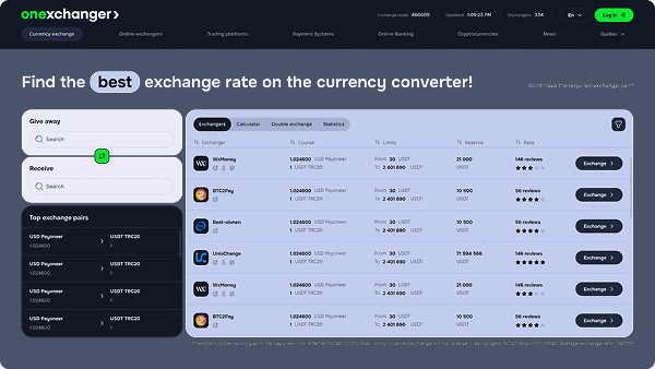
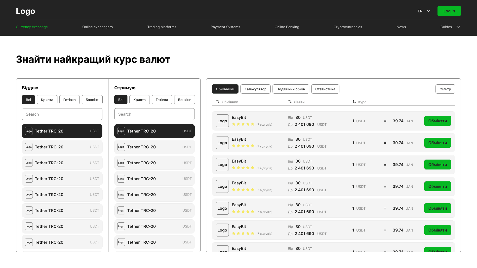
Якщо
Коли це важливо:
Люди формують перше враження про сайт майже миттєво. Ще до того, як почати вивчати послуги чи деталі, вони оцінюють, наскільки компанія виглядає сучасною, надійною та релевантною їхнім потребам. Якщо повідомлення незрозуміле, а структура перевантажена, користувачі можуть піти, так і не зрозумівши цінності бізнесу.
Часто компанії намагаються вирішити цю проблему, додаючи більше контенту, блоків і пояснень. Але причина зазвичай у структурі та чіткості комунікації. Відвідувач має одразу розуміти, чим займається компанія, кому вона допомагає і яку цінність пропонує.
Зрозуміла структура та сфокусована комунікація зменшують зайві труднощі, підвищують залученість і допомагають користувачам впевненіше рухатися сайтом.
Приклад:
Коли це важливо:
Іноді сайти поступово стають складнішими. Додаються нові сторінки, зростає кількість блоків, різні ідеї накладаються одна на одну, і з часом користуватися сайтом стає важче.
Відвідувачі не повинні замислюватися, куди натиснути далі або як працює сайт. Коли навігація заплутана або забагато елементів одночасно привертають увагу, люди швидко втрачають фокус і залишають сайт. Зрозуміла структура та прості сценарії роблять взаємодію природнішою та зручнішою.
Приклад:
Коли це важливо:
Бізнес змінюється значно швидше, ніж сайт. З’являються нові послуги, змінюється позиціонування, компанія зростає, а сайт часто залишається на рівні старої версії бізнесу.
Через це виникає розрив між тим, якою компанія є сьогодні, і тим, як її сприймають онлайн. Навіть сильний бізнес може виглядати застарілим або викликати менше довіри, якщо сайт більше не відповідає рівню продукту, сервісу чи бренду. Сучасний і цілісний цифровий досвід допомагає краще показати актуальний рівень та позиціонування компанії.
Приклад:
Коли це важливо:
Більшість людей переглядають сайти зі смартфонів, часто паралельно займаючись іншими справами або швидко шукаючи потрібну інформацію. Мобільні користувачі менш терплячі, тому навіть невеликі незручності можуть зіпсувати весь досвід.
Повільне завантаження, незручна навігація, маленькі області для натискання або погано адаптовані екрани швидко знижують залученість. Зручна мобільна версія допомагає користувачам легше переглядати сайт, довше залишатися на ньому та швидше виконувати потрібні дії.
Приклад:
Коли це важливо:
Те, що починалося як простий сайт, з часом часто стає складнішим. Нові сторінки, кампанії, блоки та оновлення контенту поступово створюють невідповідності, через які сайт втрачає цілісність і стає складнішим у підтримці.
Без масштабованої структури навіть невеликі зміни починають займати більше часу. Гнучка дизайн система та зрозуміла логіка сторінок допомагають зберігати послідовність у міру зростання бізнесу та значно спрощують майбутні оновлення й розширення.
Приклад:
Коли це важливо:
Іноді проблема не в самій послузі, а в тому, як сайт її презентує. Людина вже може бути зацікавлена, але незручний досвід створює сумніви перед тим, як зробити наступний крок.
Таке часто трапляється, коли сторінки перевантажені, важливу інформацію складно знайти або незрозуміло, що робити далі. Сайт має природно вести користувача до потрібної дії.
Зрозуміла структура, сильна комунікація та прості сценарії взаємодії допомагають відвідувачам упевненіше залишати заявки, бронювати консультації або зв’язуватися з компанією.
Приклад:
Коли це важливо:
Різні макети, стилі типографіки, кольори та елементи інтерфейсу поступово роблять сайт візуально розрізненим. Навіть якщо користувачі не можуть точно пояснити, що саме не так, вони помічають відсутність цілісності.
Єдина візуальна система робить сайт охайнішим, професійнішим і допомагає викликати більше довіри. Послідовність також значно спрощує майбутні оновлення та масштабування сайту разом із бізнесом.
Приклад:
Коли це важливо:
У міру розвитку сайту з’являється більше сторінок, послуг і контенту. З часом усе починає однаково конкурувати за увагу, через що сайт здається перевантаженим, а потрібну інформацію стає складніше знайти.
Користувачі рідко читають сайт від початку до кінця. Зазвичай вони швидко переглядають сторінку в пошуках потрібної інформації. Чітка ієрархія та правильна організація контенту допомагають швидше орієнтуватися та не перевантажують зайвою складністю.
Приклад: