Uzhnet
Uzhnet
Uzhnet
Scroll down to explore the project, learn about the request, objectives, solution, and process.
Scroll down to explore the project, learn about the request, objectives, solution, and process.
Scroll down to explore the project, learn about the request, objectives, solution, and process.
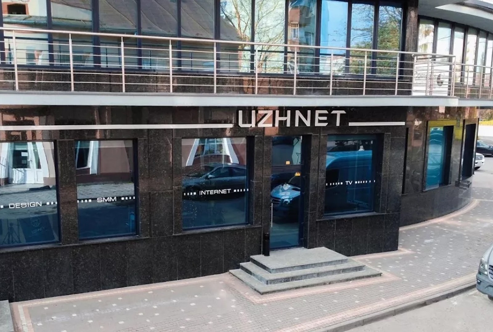
The old Uzhnet website had clearly outgrown its time, both visually and structurally. The interface felt overloaded, outdated, and no longer reflected the company’s new stage of growth. At the same time, the brand itself had gone through a visual refresh, introducing new identity elements, including its signature yellow accent. The business needed more than just a website explaining internet plans. It needed a modern digital presence that presents Uzhnet as a reliable, forward thinking provider with a strong local identity and human character.
The old Uzhnet website had clearly outgrown its time, both visually and structurally. The interface felt overloaded, outdated, and no longer reflected the company’s new stage of growth. At the same time, the brand itself had gone through a visual refresh, introducing new identity elements, including its signature yellow accent. The business needed more than just a website explaining internet plans. It needed a modern digital presence that presents Uzhnet as a reliable, forward thinking provider with a strong local identity and human character.
The old Uzhnet website had clearly outgrown its time, both visually and structurally. The interface felt overloaded, outdated, and no longer reflected the company’s new stage of growth. At the same time, the brand itself had gone through a visual refresh, introducing new identity elements, including its signature yellow accent. The business needed more than just a website explaining internet plans. It needed a modern digital presence that presents Uzhnet as a reliable, forward thinking provider with a strong local identity and human character.
The old Uzhnet website had clearly outgrown its time, both visually and structurally. The interface felt overloaded, outdated, and no longer reflected the company’s new stage of growth. At the same time, the brand itself had gone through a visual refresh, introducing new identity elements, including its signature yellow accent. The business needed more than just a website explaining internet plans. It needed a modern digital presence that presents Uzhnet as a reliable, forward thinking provider with a strong local identity and human character.

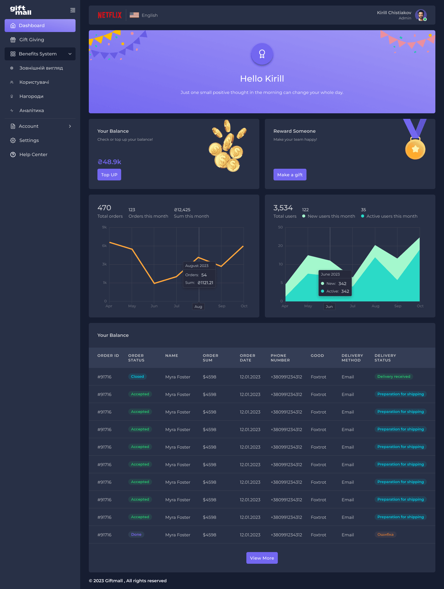
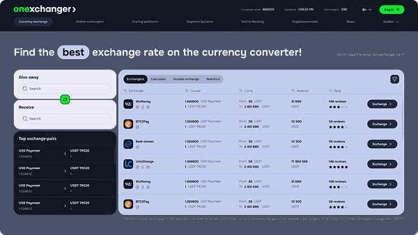
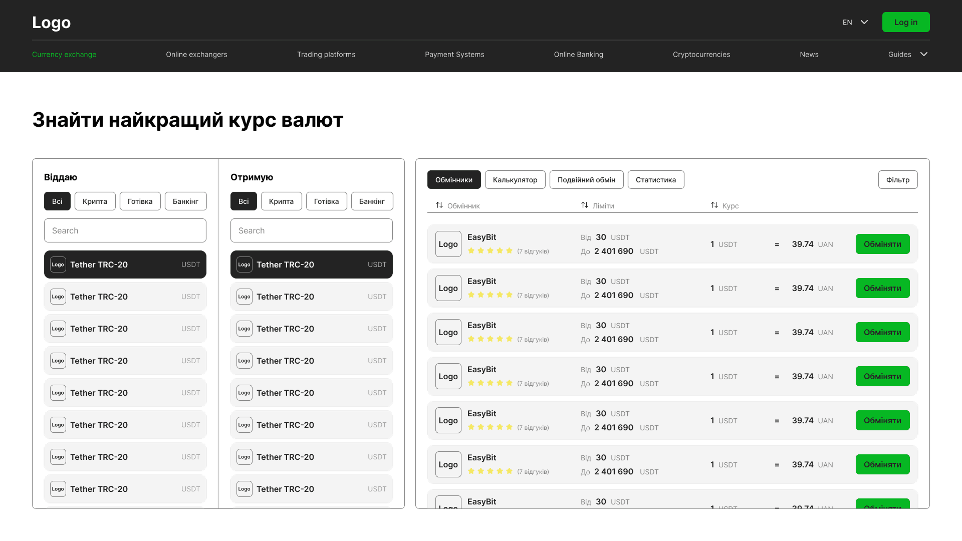
We designed a completely new website structure, including service pages, sections for business clients, news updates, social initiatives, and partnerships. The main goal was finding the balance between clarity and simplicity, giving users answers to key questions without overwhelming them. Visually, we focused on clean rhythms, combining a minimal layout with light backgrounds and strong brand accents. Instead of unnecessary corporate polish, the experience feels honest, approachable, and easy to navigate, with clear communication and no friction.
We designed a completely new website structure, including service pages, sections for business clients, news updates, social initiatives, and partnerships. The main goal was finding the balance between clarity and simplicity, giving users answers to key questions without overwhelming them. Visually, we focused on clean rhythms, combining a minimal layout with light backgrounds and strong brand accents. Instead of unnecessary corporate polish, the experience feels honest, approachable, and easy to navigate, with clear communication and no friction.
We designed a completely new website structure, including service pages, sections for business clients, news updates, social initiatives, and partnerships. The main goal was finding the balance between clarity and simplicity, giving users answers to key questions without overwhelming them. Visually, we focused on clean rhythms, combining a minimal layout with light backgrounds and strong brand accents. Instead of unnecessary corporate polish, the experience feels honest, approachable, and easy to navigate, with clear communication and no friction.
We designed a completely new website structure, including service pages, sections for business clients, news updates, social initiatives, and partnerships. The main goal was finding the balance between clarity and simplicity, giving users answers to key questions without overwhelming them. Visually, we focused on clean rhythms, combining a minimal layout with light backgrounds and strong brand accents. Instead of unnecessary corporate polish, the experience feels honest, approachable, and easy to navigate, with clear communication and no friction.

We were responsible not only for the design, but also for the HTML development. This allowed us to preserve every design decision, adapt the interface seamlessly across devices, and keep the website fast and lightweight. The result was a refreshed digital experience that feels clean, intuitive, and easy to navigate, while giving the business a much stronger online presence. Within the first months after launch, the client already noticed increased traffic and a growing number of new inquiries coming through the website.
We were responsible not only for the design, but also for the HTML development. This allowed us to preserve every design decision, adapt the interface seamlessly across devices, and keep the website fast and lightweight. The result was a refreshed digital experience that feels clean, intuitive, and easy to navigate, while giving the business a much stronger online presence. Within the first months after launch, the client already noticed increased traffic and a growing number of new inquiries coming through the website.
We were responsible not only for the design, but also for the HTML development. This allowed us to preserve every design decision, adapt the interface seamlessly across devices, and keep the website fast and lightweight. The result was a refreshed digital experience that feels clean, intuitive, and easy to navigate, while giving the business a much stronger online presence. Within the first months after launch, the client already noticed increased traffic and a growing number of new inquiries coming through the website.
We were responsible not only for the design, but also for the HTML development. This allowed us to preserve every design decision, adapt the interface seamlessly across devices, and keep the website fast and lightweight. The result was a refreshed digital experience that feels clean, intuitive, and easy to navigate, while giving the business a much stronger online presence. Within the first months after launch, the client already noticed increased traffic and a growing number of new inquiries coming through the website.
We were responsible not only for the design, but also for the HTML development. This allowed us to preserve every design decision, adapt the interface seamlessly across devices, and keep the website fast and lightweight. The result was a refreshed digital experience that feels clean, intuitive, and easy to navigate, while giving the business a much stronger online presence. Within the first months after launch, the client already noticed increased traffic and a growing number of new inquiries coming through the website.
We create service driven design for brands like Uzhnet
We create service driven design for brands like Uzhnet
We create service driven design for brands like Uzhnet
We create service driven design for brands like Uzhnet
We create service driven design for brands like Uzhnet
🧩 Interfaces that feel logical from the first second
🧩 Interfaces that feel logical from the first second
We don’t hide important information behind endless clicks or overload users with unnecessary details. Navigation feels clear immediately, helping people quickly find the path they need.
We don’t hide important information behind endless clicks or overload users with unnecessary details. Navigation feels clear immediately, helping people quickly find the path they need.
We don’t hide important information behind endless clicks or overload users with unnecessary details. Navigation feels clear immediately, helping people quickly find the path they need.
We don’t hide important information behind endless clicks or overload users with unnecessary details. Navigation feels clear immediately, helping people quickly find the path they need.
📱 Design that works on every screen
📱 Design that works on every screen
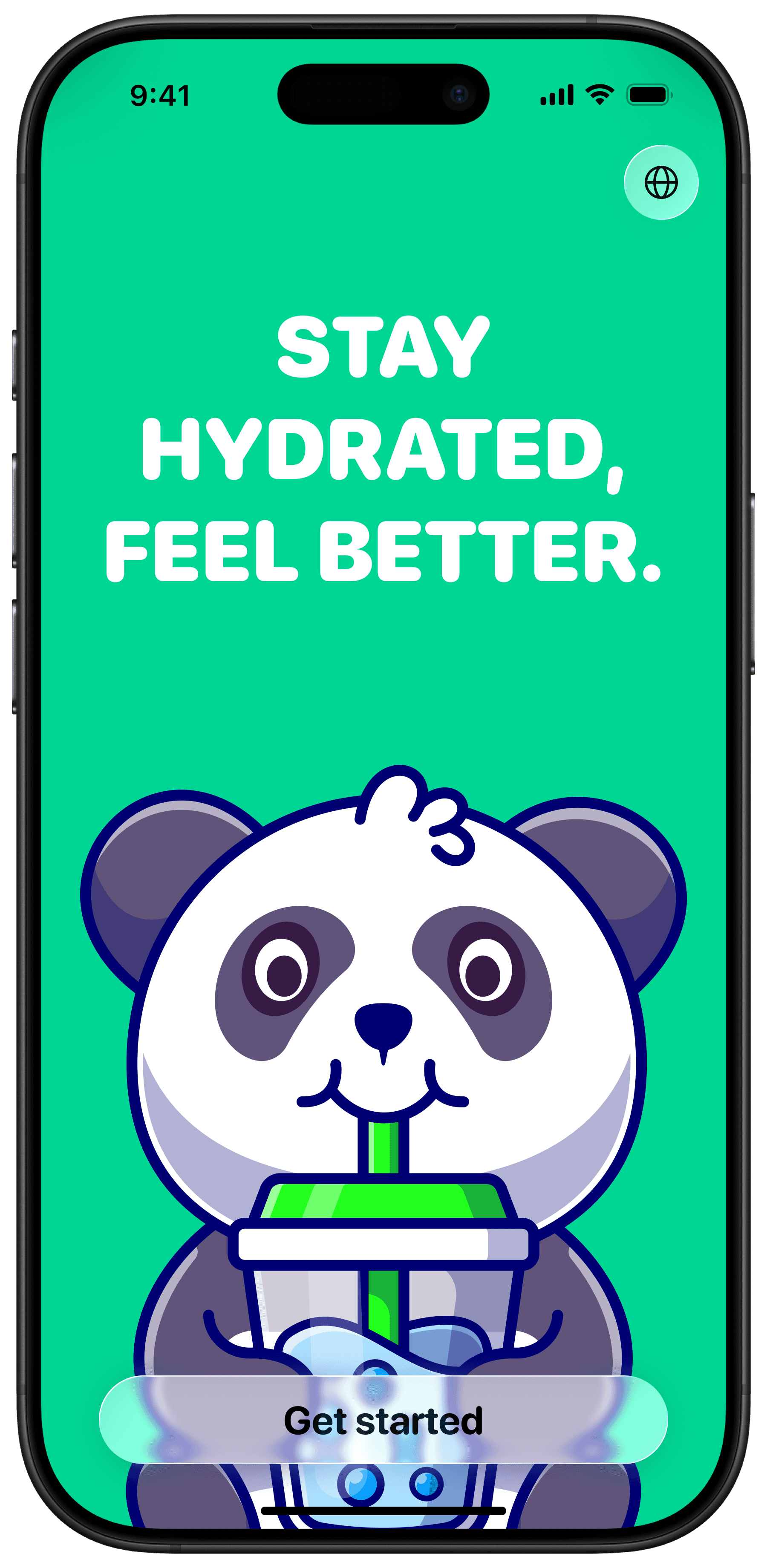
From office desktops to phones on the go, the experience stays clean, readable, and fast thanks to thoughtful responsive development and lightweight front end implementation.
From office desktops to phones on the go, the experience stays clean, readable, and fast thanks to thoughtful responsive development and lightweight front end implementation.
From office desktops to phones on the go, the experience stays clean, readable, and fast thanks to thoughtful responsive development and lightweight front end implementation.
From office desktops to phones on the go, the experience stays clean, readable, and fast thanks to thoughtful responsive development and lightweight front end implementation.
💡 Brand identity that creates emotion
💡 Brand identity that creates emotion
Color should do more than decorate. We build systems where branding shapes perception, atmosphere, and memorability. The website feels open, local, approachable, and instantly recognizable.
Color should do more than decorate. We build systems where branding shapes perception, atmosphere, and memorability. The website feels open, local, approachable, and instantly recognizable.
Color should do more than decorate. We build systems where branding shapes perception, atmosphere, and memorability. The website feels open, local, approachable, and instantly recognizable.
Color should do more than decorate. We build systems where branding shapes perception, atmosphere, and memorability. The website feels open, local, approachable, and instantly recognizable.
✨ Trust from the very first interaction
✨ Trust from the very first interaction
Strong local brands already carry reputation in the real world. Our job is translating that feeling into digital form through clarity, simplicity, honest visuals, and a natural rhythm throughout the experience.
Strong local brands already carry reputation in the real world. Our job is translating that feeling into digital form through clarity, simplicity, honest visuals, and a natural rhythm throughout the experience.
Strong local brands already carry reputation in the real world. Our job is translating that feeling into digital form through clarity, simplicity, honest visuals, and a natural rhythm throughout the experience.
Strong local brands already carry reputation in the real world. Our job is translating that feeling into digital form through clarity, simplicity, honest visuals, and a natural rhythm throughout the experience.
Thanks for watching!
Thanks for watching!
Thanks for watching!
What
we do.
What
we do.
What
we do.
We design and build solutions tailored to your product, from idea to launch.
We design and build solutions tailored to your product, from idea to launch.