
B2B SaaS Conversion: How UX Helps Turn Users into Customers
10/1/26

Author
Kirill Chistiakov

In B2B SaaS, it is not enough to simply bring a user to the website and get a sign-up. There can be a long journey between the first introduction to the product and payment: exploring features, creating an account, setting up the system, onboarding, first use, inviting team members, and only then deciding on a subscription.
At each of these stages, a portion of potential customers may abandon the product. The reason is not always price or functionality. Sometimes the user simply does not understand the product's value, cannot find the required feature, gets lost during setup, or does not see enough difference between the free and paid plans.
That is why B2B SaaS conversion must be viewed not as a single metric, but as a sequence of transitions between different stages of the user journey. UX impacts virtually every one of them.
B2B SaaS Conversion Starts Before Sign-Up
The first touchpoint with a SaaS product often occurs not within the service itself, but on the marketing website. A potential customer tries to quickly understand what the product does, who it is built for, and whether it solves their problem.
If the homepage is overloaded with information, the positioning is too abstract, and the core product capabilities require extensive searching to find, some users will leave the site before ever experiencing the product itself.
For complex B2B systems, this issue is especially relevant. A CRM, ERP, SaaS platform, or internal business tool may have dozens of features, but showing them all at once is not necessary.
At the initial stage, it is more important to explain the product's core value, showcase key use cases, and provide a clear next step.
Not Every Visitor Should Sign Up Immediately

A common mistake is designing the entire website around a single action: creating an account.
For a simple product, this might be enough. However, complex B2B solutions often require more information before a decision can be made. The user wants to see product features, integrations, pricing, use cases, and security measures to understand whether the system fits their company.
Therefore, good UX does not simply try to push a person into the sign-up form as quickly as possible. It helps them acquire enough information for the next decision.
For one user, the next step will be a free sign-up. For another, watching a demo. For a third, a consultation or a call with a sales rep. The interface must support various scenarios if they align with the product's sales model.
The Sign-Up Form Should Not Become the First Barrier
The user is already interested in the product and has decided to create an account. At this point, unnecessary friction is particularly hazardous.
An excessive number of fields, unclear password requirements, mandatory details that are not yet needed for work, or multiple screens without progress indicators multiply the drop-off points where a person might abandon the process.
This does not mean that every registration must be reduced to a single field. A B2B product may genuinely require company details, the user's role, or team size. However, every additional question must serve a clear purpose.
If certain data can be gathered later once the user has already started using the product, it is not necessary to demand it prior to account creation.
Activation Shows Whether the User Experienced Real Product Value

Sign-up does not mean that a person has become an active user. It merely grants access to the product.
Much more crucial is the moment when the user experiences real value for the first time. For a CRM, this might be importing contacts and creating the first deal. For an analytics platform, connecting a data source and generating the first report. For a team management system, setting up a workspace and inviting team members.
This is the precise moment that needs to be identified for a specific product and systematically measured.
If users are signing up, but a significant portion never reaches that first meaningful action, the problem may not be marketing. It is worth investigating what happens immediately after account creation.
Time to Value Matters
Time to Value shows how long it takes for a new user to achieve their first tangible result from the product.
The more complex the SaaS system, the longer this path can be. Sometimes, before starting work, users need to create an organization, add employees, configure roles, connect integrations, and import data.
Eliminating these steps entirely is impossible. However, they can be made much clearer.
Display setup progress, explain why each step is necessary, pre-fill information wherever possible, and avoid forcing users to configure features they do not need yet.
The goal of effective onboarding is not to showcase the entire product. It should guide the user to their first meaningful result as quickly as possible.
Onboarding Should Enable Work, Not Just Showcase Features

A lengthy ten-screen walkthrough covering product features does not guarantee that the user will understand how to use it.
People learn interfaces much better within the context of a real task. Therefore, instead of demonstrating all features at once, it is far more effective to help them complete their first scenario.
Tooltips, concise instructions, sample data, templates, checklists, and contextual guidance can significantly simplify the initial steps.
At the same time, it is critical to keep the user in control. An experienced user may already know what they need, so onboarding should always allow for skipping or condensing.
Retention Begins After Successful Onboarding
A user can successfully complete initial setup and still abandon the product several weeks later.
Therefore, the next vital stage is embedding the SaaS into their regular workflow.
Here, the quality of core user journeys, task execution speed, intuitive navigation, and predictable interface behavior become paramount.
If a routine daily operation requires navigating through several redundant screens every single time, the friction recurs constantly. One extra click may seem insignificant, but after hundreds of repetitions, it turns into a continuous source of frustration.
That is why the UX of complex SaaS products must be evaluated not only during initial use, but also in the context of daily work.
Churn Can Be a Signal of UX Problems

Users churn from SaaS products for many reasons. Business shifts, budgets, competitors, a missing feature, or perceived low value can all impact churn.
Therefore, one should not automatically attribute every churn case to poor UX.
However, if users consistently drop off after the exact same step, fail to adopt critical features, or repeatedly contact support with identical issues, the interface itself demands investigation.
Analytics can show where the problem occurs. UX research helps understand why it happens.
It is the combination of quantitative data and real user observations that delivers a comprehensive picture.
Adoption of Key Features Matters More Than Feature Count
A SaaS product can actively evolve for years. Every release introduces new capabilities, but that does not guarantee that users will adopt them.
Some features may remain unnoticed due to complicated information architecture, poor naming, or presentation at the wrong time.
Thus, it is beneficial to measure not just overall activity, but the adoption of key product capabilities.
If a specific feature correlates strongly with retention or upgrading to a paid plan, yet most users fail to find it, the issue often lies squarely in UX.
Sometimes, improving the discoverability of an existing feature yields higher returns for the product than building a brand-new one.
The Dashboard Must Facilitate Decision-Making

For many B2B SaaS products, the dashboard is one of the primary screens. This is where users assess system status, view performance, and decide what to do next.
Problems arise when the dashboard attempts to display everything simultaneously.
Dozens of charts, metrics, tables, and alerts generate a high volume of data, but do not necessarily foster greater understanding.
A well-designed dashboard needs a clear hierarchy. Key indicators should be immediately visible, secondary information accessible on demand, and data should ideally tie directly to actionable next steps.
The user should not merely see a number, but understand what it signifies and whether any action is required.
Personalization Is Vital for Complex B2B Systems
A single SaaS platform may be used by individuals with completely different objectives.
An executive needs high-level metrics and performance oversight. A manager works with operational processes. A financial specialist tracks payments. An administrator oversees users, permissions, and configurations.
Presenting the exact same interface to everyone quickly makes the product feel cluttered and overwhelming.
Role-based UX enables tailoring information, navigation, and available actions to match the specific responsibilities of each role.
This does not mean building separate products for each user type. Often, it is sufficient to set clear priorities and strip away redundant information from primary workflows.
Referrals Depend on Genuine Product Value
User referrals can serve as a powerful growth channel for SaaS, but simply adding an "Invite a Friend" button to the menu is not enough.
People recommend a product when they see real value in it and are willing to stake their own reputation on it.
Therefore, referrals start long before any referral program. They depend entirely on how effectively the product solves the user's problem.
The referral mechanic itself should minimize friction for the next step. Inviting a colleague, sharing an output, creating a shared workspace, or sharing a link should be effortless.
For team-oriented B2B products, such mechanics can be a natural component of the core workflow rather than an isolated marketing feature.
Upgrading to a Paid Plan Must Have Clear Value

A user may actively engage with a free or trial version, but that still does not mean they are ready to pay.
At the Revenue stage, it is crucial to articulate clearly what changes once they upgrade to a paid tier.
A list of twenty features rarely drives conversion. It is far better to convey the difference through practical capabilities and the user's specific goals.
For instance, a higher tier might allow inviting more team members, automating a certain process, accessing advanced analytics, or integrating the system with other business tools.
Users must understand not only what they are getting, but why they actually need it.
The Pricing Page Is Part of the Product UX
The pricing page is often treated purely as marketing collateral, whereas it is actually an integral part of the user journey.
Visitors must be able to easily compare tiers, understand limitations, view pricing, and identify which option meets their needs.
When there are too many tiers, differences are phrased in confusing terms, and critical conditions are hidden in footnotes, deciding becomes far harder.
For B2B products, illustrating scenarios for various team sizes or company types can also prove helpful. This allows the user to quickly map the offering to their specific situation.
Do Not Force Users to Pay Before Experiencing Value
The timing of when the product requests payment details is critical.
For certain SaaS models, requiring a credit card upfront during a trial is a standard practice. For others, it creates an unnecessary barrier before the user has even grasped the product's value.
There is no universal solution for every SaaS business.
It is best to test various approaches and track the entire journey to becoming a paying customer, rather than focusing solely on the volume of sign-ups. An approach yielding fewer trial users may prove more effective if those users convert to paying accounts at a higher rate.
Therefore, individual UX changes should never be evaluated through a single isolated metric.
Which B2B SaaS Metrics to Analyze Together

Conversion rates vary across different stages of the user journey. That is why a single aggregated number fails to reveal where the product is actually losing prospective customers.
During the acquisition phase, you can analyze traffic to key landing pages, interaction with content, and conversion to the next target action.
Post-registration, metrics like Activation Rate, Time to Value, and onboarding milestone completion become essential.
During regular usage, focus on active usage, retention, churn, and core feature adoption.
At the monetization stage, conversion to paid plans, ARPU, CAC, LTV, and other core product economics metrics come to the forefront.
The key is not merely aggregating these metrics into an analytics dashboard, but understanding the correlations between them.
Do Not Optimize Metrics in Isolation from User Experience
An interface adjustment can improve one metric while degrading another.
For example, an aggressive upgrade modal might increase click-through rates to the checkout page, yet provoke frustration among loyal active users.
Shortening the sign-up process may increase total accounts created, but attract more individuals outside the product's target audience.
Thus, SaaS conversion rate optimization (CRO) must not devolve into an endless optimization of individual buttons.
One must examine the end-to-end user journey and assess how a change influences downstream stages of the funnel.
How to Uncover UX Issues Impacting Conversion
Product analytics serves as a solid starting point. It reveals the screens and stages where users most frequently abandon the product or fail to complete intended actions.
Afterward, it is crucial to analyze user behavior in greater detail. Session recordings, heatmaps, interviews, and usability testing uncover the root causes behind the issues.
For instance, analytics might reveal that many users abandon integration setup midway. However, only research can reveal that users misunderstand the terminology, do not know where to find their API key, or fear setting up access permissions incorrectly.
This is why qualitative and quantitative methodologies are best utilized in tandem.
A UX Audit Uncovers Drop-Off Points

When a SaaS product has existed for several years, issues often accumulate incrementally. New features, roles, pricing plans, and integrations are continuously added. Legacy workflows change, yet the underlying information architecture often stays untouched.
Consequently, the product becomes increasingly complex, even though every single isolated update seemed rational at the time.
A UX audit evaluates the system as a unified user journey. Where do superfluous steps emerge? Which capabilities are hard to locate? Is navigation clear? Where do users drop off? Does the interface serve the real objectives of various user roles?
From there, you can formulate hypotheses, prioritize critical issues, and validate them with real users.
Not Every Issue Demands a Complete Redesign
If conversion drops at one specific stage, there is no need to overhaul the entire SaaS platform.
Often, the issue is isolated to a single flow: the registration form, onboarding, the pricing page, dashboard structure, or the checkout process.
Targeted optimizations can be much faster and safer than an extensive redesign.
However, if issues recur across various parts of the platform, users get lost in navigation, the interface feels inconsistent, and introducing new features becomes increasingly challenging, a comprehensive product review is warranted.
Good UX Drives SaaS Growth Across the Entire Funnel
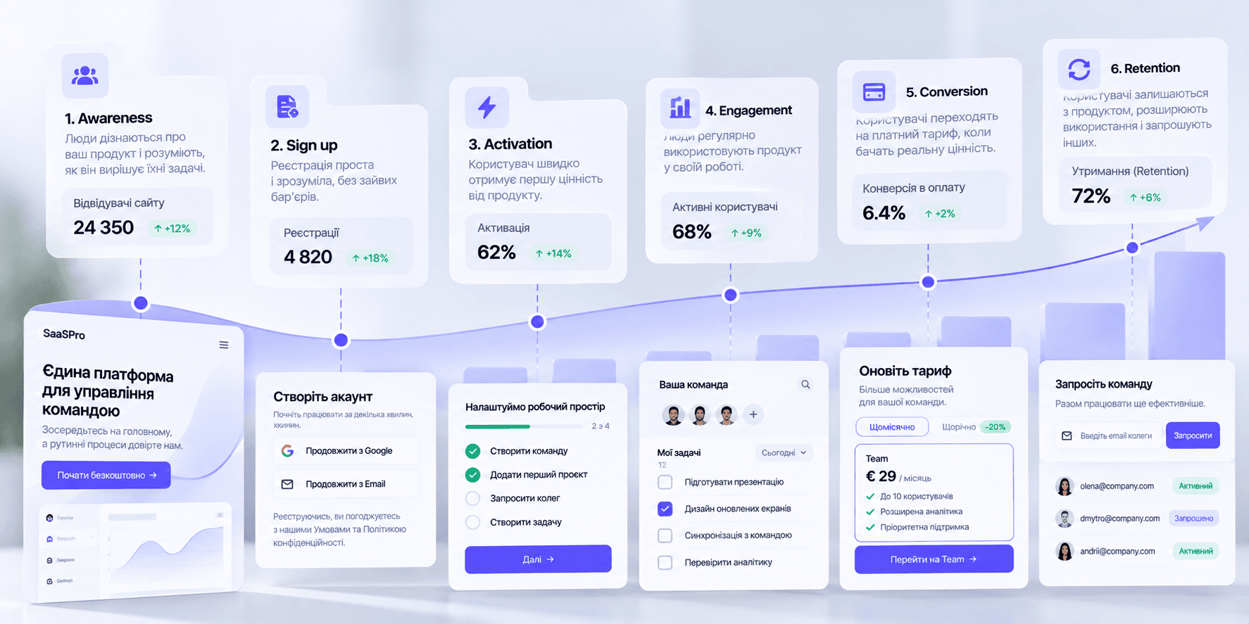
B2B SaaS conversion is not driven by a single button or page. It is the cumulative result of dozens of interactions between the user and the product.
First, a user needs to understand the value proposition. Then, sign up effortlessly. Next, experience initial value, master the product, integrate it into their routine workflow, and perceive enough ongoing value to upgrade to a paid plan.
Every unnecessary barrier along this journey can decrease the number of users advancing to the next stage.
This is why UX in B2B SaaS should be regarded as more than interface design. It is a fundamental part of the product model that influences activation, retention, adoption, churn, and revenue generation.
The more complex the SaaS product, the more essential it is to make its logic intuitive for the user—not by eliminating the inherent complexity of the business process, but by organizing it properly within the interface.


" width="68.80023495816431px"><path d="M 4.853 0.229 C 2.752 -0.794 0.742 1.857 0 3.31 C 0.62 7.42 0.421 10.396 0.244 11.37 C 1.34 12.771 4.906 13.54 5.957 11.548 C 7.007 9.558 7.477 1.511 4.852 0.23 Z" fill="rgb(255, 255, 255)" height="12.755288116790886px" id="ZCZVTiIXa" stroke-dasharray="" stroke-linecap="butt" stroke-linejoin="miter" stroke-miterlimit="10" stroke-width="1.23" stroke="rgb(0, 0, 0)" transform="translate(62.007 43.767)" width="6.793097659580333px"/><path d="M 0 0 C 1.437 0.617 2.272 3.716 0.258 5.234" fill="transparent" height="5.233798974902236px" id="AacllobhZ" stroke-dasharray="" stroke-linecap="butt" stroke-linejoin="miter" stroke-miterlimit="10" stroke-width="1.23" stroke="rgb(0, 0, 0)" transform="translate(64.709 47.658)" width="1.4545419866479055px"/><path d="M 1.94 0.229 C 4.041 -0.794 6.051 1.857 6.794 3.31 C 6.173 7.42 6.372 10.396 6.549 11.37 C 5.454 12.771 1.887 13.54 0.837 11.548 C -0.214 9.558 -0.684 1.511 1.94 0.23 Z" fill="rgb(255, 255, 255)" height="12.755288116790886px" id="pEDJQVy2w" stroke-dasharray="" stroke-linecap="butt" stroke-linejoin="miter" stroke-miterlimit="10" stroke-width="1.23" stroke="rgb(0, 0, 0)" transform="translate(0 43.767)" width="6.7942440549467005px"/><path d="M 1.455 0 C 0.018 0.617 -0.818 3.716 1.197 5.234" fill="transparent" height="5.233798974902236px" id="xOvJKZNxm" stroke-dasharray="" stroke-linecap="butt" stroke-linejoin="miter" stroke-miterlimit="10" stroke-width="1.23" stroke="rgb(0, 0, 0)" transform="translate(2.638 47.658)" width="1.4550601551503437px"/><path d="M 38.403 68.113 C 26.454 72.892 13.11 63.334 7.932 57.955 C 2.196 50.786 0.363 36.246 0.164 29.874 C -0.314 26.05 0.363 17.527 0.763 13.743 L 3.749 5.376 L 14.504 1.195 L 37.806 0 C 39.997 0.398 45.454 1.553 49.755 2.987 C 55.133 4.78 57.522 13.742 58.121 16.133 C 58.599 18.044 58.32 34.853 58.121 43.019 C 57.522 47.798 53.341 62.138 38.403 68.113 Z" fill="rgb(255, 255, 255)" height="69.41149940138297px" id="yZYyIx6io" stroke-dasharray="" stroke-linecap="butt" stroke-linejoin="round" stroke-width="1.23" stroke="rgb(0, 0, 0)" transform="translate(4.872 16.589)" width="58.38457217823136px"/><path d="M 16.131 9.081 C 13.941 3.704 7.648 -4.303 0 6.69 C 2.191 10.675 8.485 16.728 16.131 9.081 Z M 28.678 7.886 C 30.868 2.508 37.162 -5.497 44.809 5.496 C 42.619 9.479 36.326 15.534 28.678 7.886 Z" fill="transparent" height="12.75153470949805px" id="Q5nplVQds" stroke-dasharray="" stroke-linecap="butt" stroke-linejoin="miter" stroke-miterlimit="10" stroke-width="1.23" stroke="rgb(0, 0, 0)" transform="translate(11.605 43.954)" width="44.80918164991997px"/><path d="M 0 4.182 C 0 1.872 1.872 0 4.182 0 C 6.492 0 8.364 1.872 8.364 4.182 C 8.364 6.492 6.492 8.364 4.182 8.364 C 1.872 8.364 0 6.492 0 4.182 Z" fill="rgb(0, 0, 0)" height="8.364249629374285px" id="CsixW4Nye" transform="translate(43.274 45.863)" width="8.364249629374271px"/><path d="M 0 4.182 C 0 1.872 1.872 0 4.182 0 C 6.492 0 8.364 1.872 8.364 4.182 C 8.364 6.492 6.492 8.364 4.182 8.364 C 1.872 8.364 0 6.492 0 4.182 Z" fill="rgb(0, 0, 0)" height="8.364249629374264px" id="mtQGxWjK3" transform="translate(14.591 47.061)" width="8.364249629374267px"/><path d="M 0 1.195 C 0 0.535 0.535 0 1.195 0 C 1.856 0 2.391 0.535 2.391 1.195 C 2.391 1.856 1.856 2.391 1.195 2.391 C 0.535 2.391 0 1.856 0 1.195 Z" fill="rgb(255, 255, 255)" height="2.3908386866572187px" id="w8AgI4KSu" transform="translate(48.05 48.255)" width="2.390838686657247px"/><path d="M 0 1.195 C 0 0.535 0.535 0 1.195 0 C 1.856 0 2.391 0.535 2.391 1.195 C 2.391 1.856 1.856 2.391 1.195 2.391 C 0.535 2.391 0 1.856 0 1.195 Z" fill="rgb(255, 255, 255)" height="2.3908386866572187px" id="RFyjFdh2K" transform="translate(19.375 49.451)" width="2.3908386866572506px"/><path d="M 4.036 1.556 C 1.73 1.146 0.385 3.427 0 5.128 C 2.306 3.086 4.036 3.257 4.613 3.596 C 6.459 5.23 11.149 5.299 13.263 5.128 C 17.876 4.618 15.569 1.554 13.84 2.065 C 12.616 2.425 6.919 2.065 4.036 1.554 Z M 40.698 0.085 C 43.061 -0.431 44.581 1.513 45.076 3.004 C 42.574 1.336 40.795 1.601 40.218 1.943 C 38.402 3.519 33.557 3.889 31.36 3.875 C 26.562 3.724 28.774 0.842 30.591 1.184 C 31.876 1.424 37.746 0.73 40.698 0.085 Z" fill="rgb(0, 0, 0)" height="5.192087782726427px" id="gD39dSMek" stroke-dasharray="" stroke-linecap="butt" stroke-linejoin="miter" stroke-miterlimit="10" stroke-width="1.23" stroke="rgb(0, 0, 0)" transform="translate(11.346 36.58)" width="45.07578690879518px"/><path d="M 56.257 17.784 C 61.635 20.772 61.235 35.509 60.439 42.878 C 58.528 41.444 57.65 36.305 57.451 33.917 C 57.451 20.054 45.9 18.183 40.125 18.979 C 33.91 22.325 22.798 21.17 18.017 20.175 C 4.634 18.741 2.086 35.51 2.484 44.073 C 1.05 39.772 1.488 30.332 1.886 26.148 C 0.93 25.671 -0.106 21.967 0.093 20.175 C -0.385 17.306 1.089 16.192 1.886 15.993 C 0.452 13.124 1.289 11.212 2.484 10.615 C 1.05 8.224 4.675 5.238 6.666 4.042 C 6.187 2.13 9.255 1.253 10.848 1.055 C 10.848 0.1 15.23 0.259 16.823 1.055 C 17.779 -0.856 21.602 0.259 23.396 1.055 C 25.187 -1.334 31.163 2.25 31.76 1.653 C 32.357 1.054 43.71 4.042 50.283 8.225 C 55.541 11.57 56.456 15.991 56.257 17.784 Z" fill="rgb(0, 0, 0)" height="44.07331699872831px" id="IBXo1afcW" stroke-dasharray="" stroke-linecap="butt" stroke-linejoin="round" stroke-width="1.23" stroke="rgb(0, 0, 0)" transform="translate(3.149 0)" width="60.90540811136909px"/><path d="M 4.914 8.6 C 4.928 7.32 3.966 4.3 0 2.457 M 14.743 6.143 C 14.758 4.863 13.795 1.843 9.829 0 M 25.8 6.143 C 25.815 4.863 24.852 1.843 20.886 0 M 38.086 9.829 C 38.1 8.549 37.138 5.529 33.172 3.686" fill="transparent" height="9.828730631218367px" id="yF9hvy0D6" stroke-dasharray="" stroke-linecap="butt" stroke-linejoin="miter" stroke-miterlimit="10" stroke-width="1.23" stroke="rgb(255, 255, 255)" transform="translate(10.118 1.229)" width="38.08647011135237px"/><path d="M 15.972 6.143 C 12.985 1.508 5.609 -4.983 0 6.143" fill="transparent" height="6.143186797809202px" id="S7kDdhPuD" stroke-dasharray="" stroke-linecap="butt" stroke-linejoin="round" stroke-width="1.23" stroke="rgb(0, 0, 0)" transform="translate(27.028 65.115)" width="15.971687012612456px"/><path d="M 3.106 0.493 C 4.998 3.584 7.703 9.993 3.395 10.901 C -1.99 12.035 0.346 1.417 1.566 0" fill="transparent" height="10.985871866875232px" id="m1g0PK9jZ" stroke-dasharray="" stroke-linecap="butt" stroke-linejoin="round" stroke-width="1.23" stroke="rgb(0, 0, 0)" transform="translate(31.777 54.002)" width="5.699674962042929px"/></g></svg>)