
Waterone
Waterone
Waterone
Scroll down to explore the project, learn about the request, objectives, solution, and process.
Scroll down to explore the project, learn about the request, objectives, solution, and process.
Scroll down to explore the project, learn about the request, objectives, solution, and process.
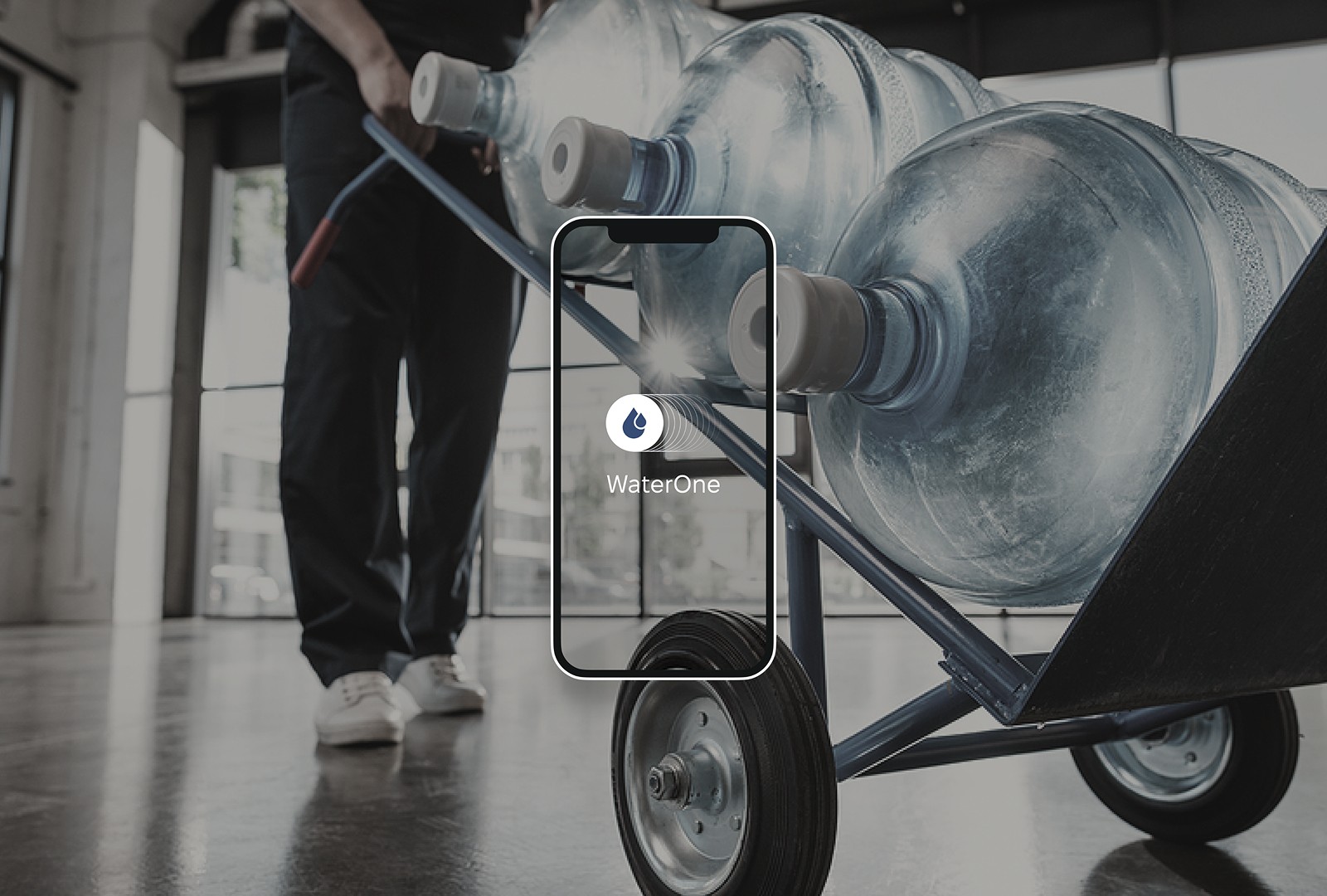
WaterOne is a local water delivery service based in Pennsylvania that decided to completely rethink the customer experience. Previously, orders were handled manually through phone calls, messages, and confirmation chats. The process created unnecessary friction, wasted time, and often led to mistakes. The business already had a stable customer base, but scaling further became difficult without a proper digital product. The goal was ambitious. To create an experience that changes the everyday habit of ordering water and makes it as simple and comfortable as possible for every household. Our primary audience included families, parents with children, elderly customers, and suburban households. For them, the product had to feel intuitive from the very first interaction. No explanations, no complexity, no unnecessary actions. Every extra click becomes extra effort. That’s why the entire product was built around simplicity, predictability, minimal text, and clear user focused interactions.
WaterOne is a local water delivery service based in Pennsylvania that decided to completely rethink the customer experience. Previously, orders were handled manually through phone calls, messages, and confirmation chats. The process created unnecessary friction, wasted time, and often led to mistakes. The business already had a stable customer base, but scaling further became difficult without a proper digital product. The goal was ambitious. To create an experience that changes the everyday habit of ordering water and makes it as simple and comfortable as possible for every household. Our primary audience included families, parents with children, elderly customers, and suburban households. For them, the product had to feel intuitive from the very first interaction. No explanations, no complexity, no unnecessary actions. Every extra click becomes extra effort. That’s why the entire product was built around simplicity, predictability, minimal text, and clear user focused interactions.

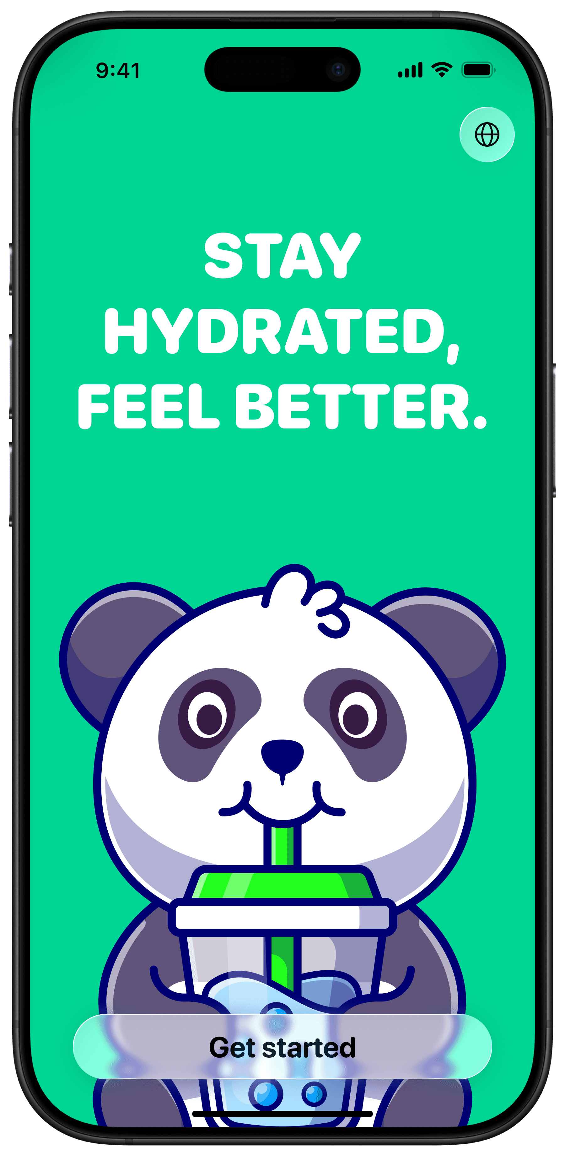
The project began with deep product research. We conducted a series of interviews with both business owners and potential users, mapped frustrations, and identified the core needs behind the service. From there, we developed and validated multiple hypotheses through wireframes, clickable prototypes, and continuous testing. More than 500 screens were created before arriving at the final structure. Over the course of six months, a team of four people, two product designers, a lead, and a project manager, gradually turned the idea into a fully realized product. We handled the entire product cycle, from UX logic and wireframes to UI design, typography, illustration systems, and interaction design. For the visual identity, we chose the Fixel typeface by MacPaw. Modern, approachable, and highly functional. The color palette was intentionally restrained, focused on clarity, trust, and the feeling of water itself. Special attention was given to the ordering flow. The experience was designed to feel almost effortless, allowing users to place an order in just a tap, without registrations, confirmation calls, or unnecessary steps.
The project began with deep product research. We conducted a series of interviews with both business owners and potential users, mapped frustrations, and identified the core needs behind the service. From there, we developed and validated multiple hypotheses through wireframes, clickable prototypes, and continuous testing. More than 500 screens were created before arriving at the final structure. Over the course of six months, a team of four people, two product designers, a lead, and a project manager, gradually turned the idea into a fully realized product. We handled the entire product cycle, from UX logic and wireframes to UI design, typography, illustration systems, and interaction design. For the visual identity, we chose the Fixel typeface by MacPaw. Modern, approachable, and highly functional. The color palette was intentionally restrained, focused on clarity, trust, and the feeling of water itself. Special attention was given to the ordering flow. The experience was designed to feel almost effortless, allowing users to place an order in just a tap, without registrations, confirmation calls, or unnecessary steps.


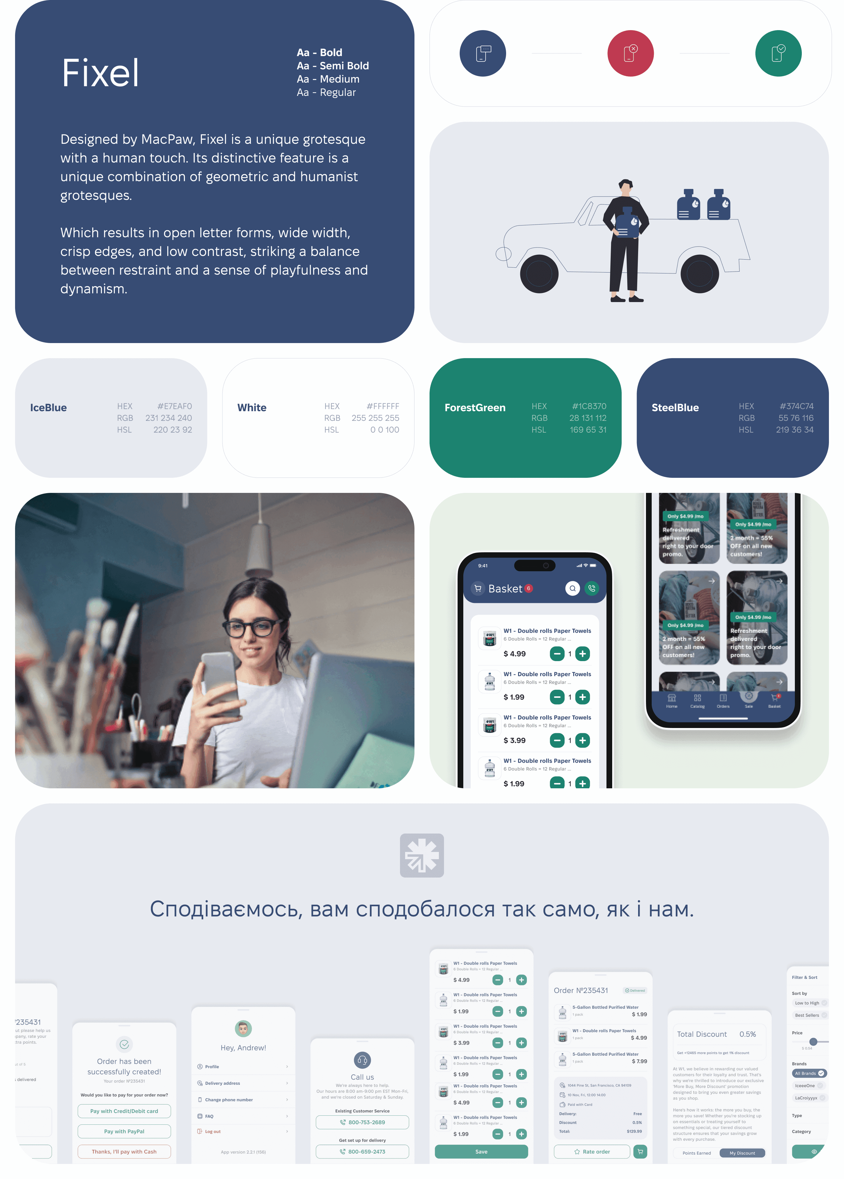
WaterOne received a simple and intuitive product that requires almost no explanation. Test users moved through the flow naturally, often without even reading the interface text. Placing an order now takes less than a minute. The client was highly satisfied with the result and is preparing for a full launch later this summer. The team is already planning the second phase of the product, including subscriptions, loyalty features, and delivery schedule notifications. For us, this project became another example of how thoughtful product design can turn an everyday routine into something smooth, effortless, and genuinely pleasant to use.
WaterOne received a simple and intuitive product that requires almost no explanation. Test users moved through the flow naturally, often without even reading the interface text. Placing an order now takes less than a minute. The client was highly satisfied with the result and is preparing for a full launch later this summer. The team is already planning the second phase of the product, including subscriptions, loyalty features, and delivery schedule notifications. For us, this project became another example of how thoughtful product design can turn an everyday routine into something smooth, effortless, and genuinely pleasant to use.
What we create for products like WaterOne
What we create for products like WaterOne
What we create for products like WaterOne
What we create for products like WaterOne
What we create for products like WaterOne
💧 Design that explains itself
💧 Design that explains itself
We don’t create visuals just for aesthetics, every element has a purpose. Buttons, colors, spacing, and interactions are designed around clarity and predictability. Users understand what to do before they ever need instructions.
We don’t create visuals just for aesthetics, every element has a purpose. Buttons, colors, spacing, and interactions are designed around clarity and predictability. Users understand what to do before they ever need instructions.
We don’t create visuals just for aesthetics, every element has a purpose. Buttons, colors, spacing, and interactions are designed around clarity and predictability. Users understand what to do before they ever need instructions.
📱 Interfaces anyone can use
📱 Interfaces anyone can use
The audience isn’t made up of tech people. It’s families, busy parents, grandparents, and everyday users. We design products that feel intuitive for everyone. No confusion, no learning curve, no unnecessary steps.
The audience isn’t made up of tech people. It’s families, busy parents, grandparents, and everyday users. We design products that feel intuitive for everyone. No confusion, no learning curve, no unnecessary steps.
The audience isn’t made up of tech people. It’s families, busy parents, grandparents, and everyday users. We design products that feel intuitive for everyone. No confusion, no learning curve, no unnecessary steps.
🚚 Simple UX for complex systems
🚚 Simple UX for complex systems
Orders, repeat deliveries, notifications, schedules, addresses. Under the hood, the logic can be complex, but the experience shouldn’t feel that way. We turn operational complexity into clean and effortless interactions.
Orders, repeat deliveries, notifications, schedules, addresses. Under the hood, the logic can be complex, but the experience shouldn’t feel that way. We turn operational complexity into clean and effortless interactions.
Orders, repeat deliveries, notifications, schedules, addresses. Under the hood, the logic can be complex, but the experience shouldn’t feel that way. We turn operational complexity into clean and effortless interactions.
🔧 Ready for development and scaling
🔧 Ready for development and scaling
Our design systems are built for real production. Components, states, flows, and documentation are prepared with development in mind, so engineers don’t have to guess what the designer meant.
Our design systems are built for real production. Components, states, flows, and documentation are prepared with development in mind, so engineers don’t have to guess what the designer meant.
Our design systems are built for real production. Components, states, flows, and documentation are prepared with development in mind, so engineers don’t have to guess what the designer meant.
Thanks for watching!
Thanks for watching!
Thanks for watching!
What
we do 👇
What
we do 👇
What
we do 👇
We design and build solutions tailored to your product, from idea to launch.
We design and build solutions tailored to your product, from idea to launch.
SaaS
design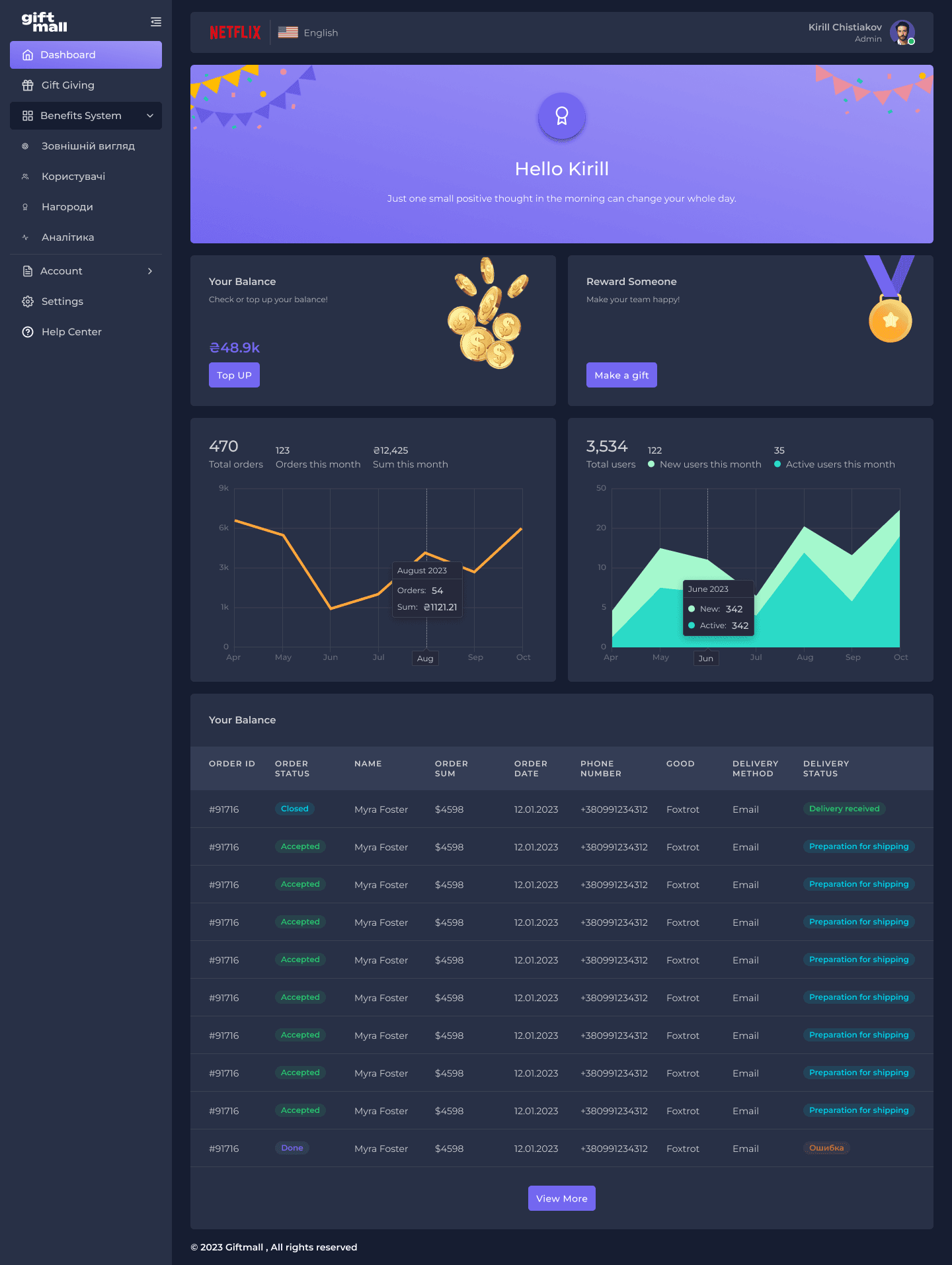
UI/UX
services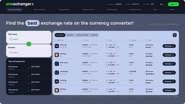
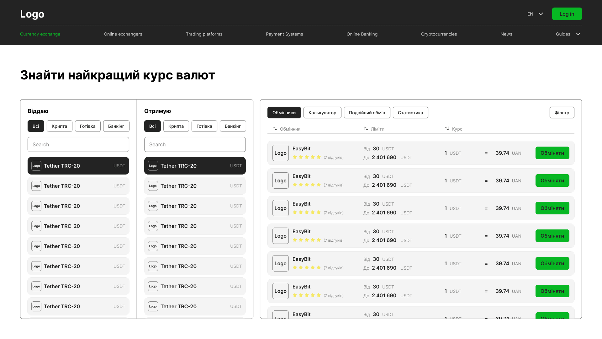
Igaming
design
Web
design

SaaS
designUI/UX
servicesIgaming
designWeb
design
